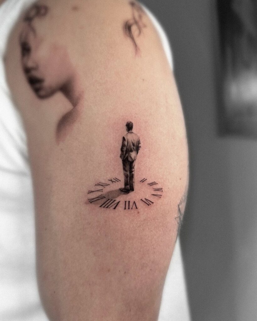
The ideas here run from a plain clock dial to a Time Piece design with more going on, and the spot you have picks the winner: a clock needs room for its numerals, and a small wrist forces a simpler design.
Roman numerals get fuzzy fast on a small dial, while a larger area gives a Melting Clock or a Broken Clock room to stay readable.
If you want words in the piece, I would keep them short, the way Time Is Money or One Day at a Time do, since long lines mean small lettering, and small lettering blurs first.
1. Clock Tattoo
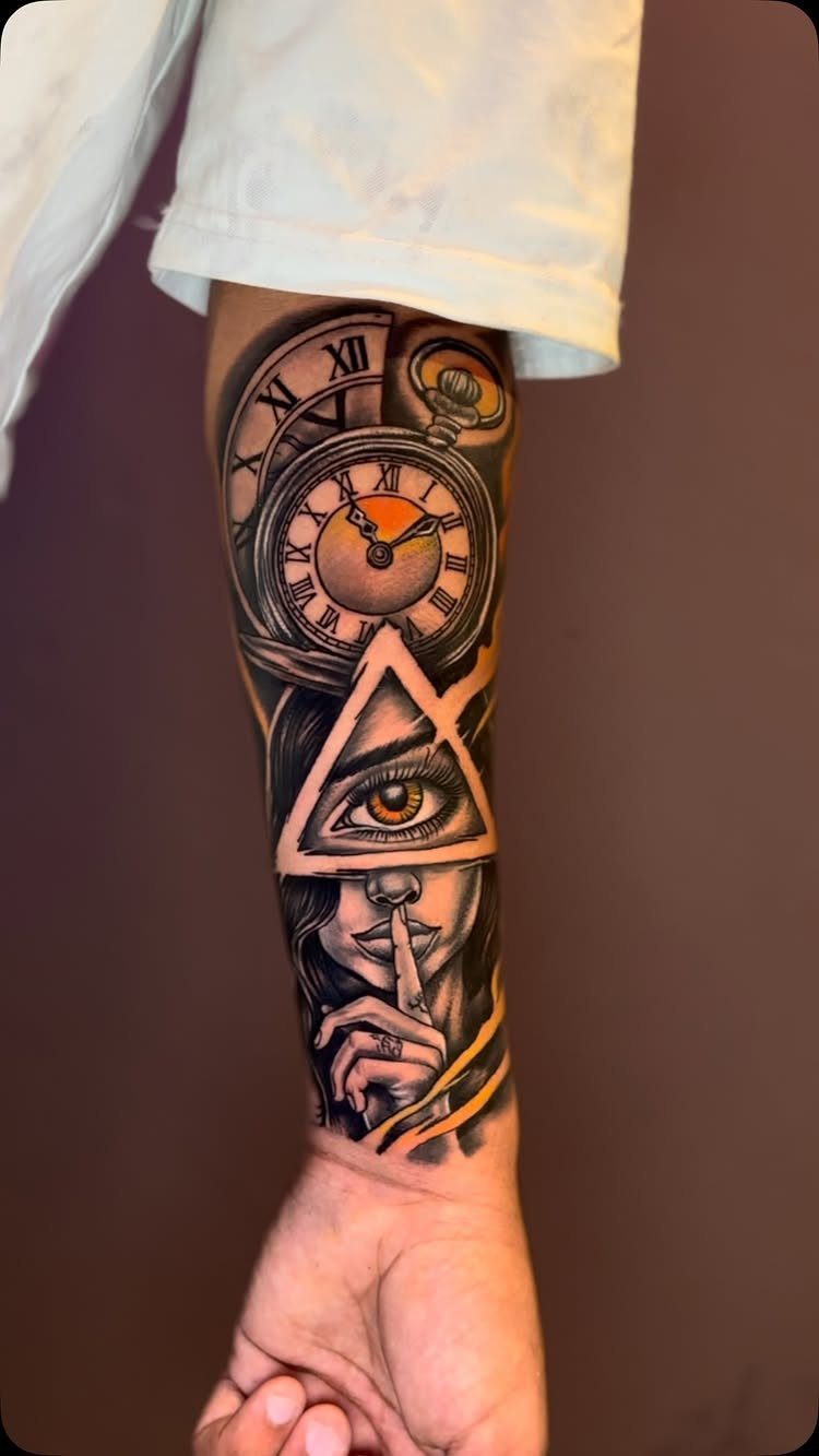
A clock face is the easiest way to say time without a word, and it stacks well with other symbols.
A pocket watch beside a face and an eye in a triangle reads as a layered piece, not a plain dial.
Before you commit, decide what the clock should say.
Setting the hands to a birth time or a date that changed your life gives a stock image a private meaning. I would pick that over a generic 10:10.
On a forearm, the dial needs room so the numerals stay readable years from now.
2. Hourglass Tattoo
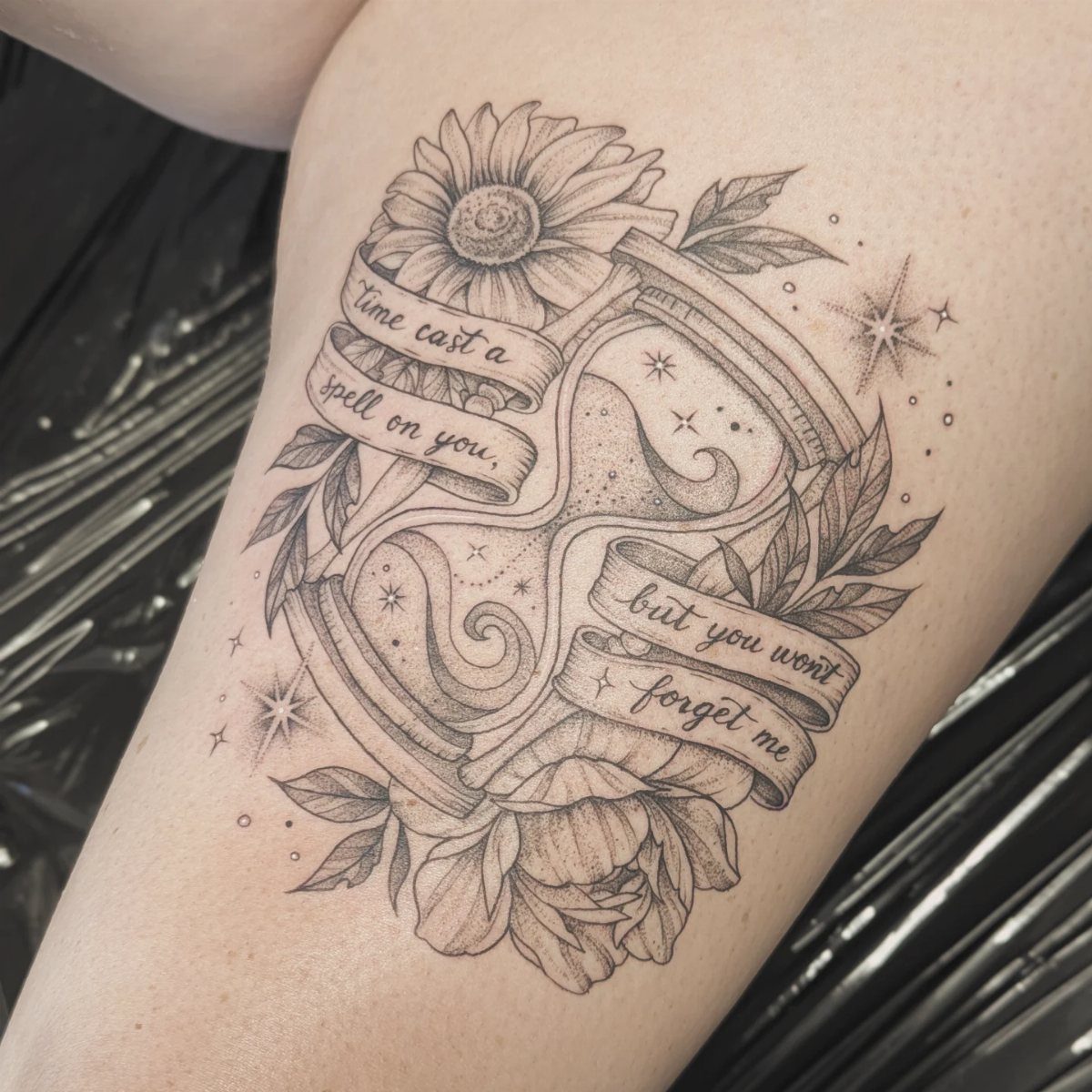
Sand running through glass suits anyone who sees time as something that can start over. Flowers and ribbon banners soften the hourglass, and the banner gives you space for a line of your own, like the one in this piece.
I like a short line for the banner.
Long sentences force small lettering, and small lettering is what blurs first. Black and grey keeps the glass and petals readable, and the thigh gives you room to run the ribbons long.
3. Broken Clock Tattoo
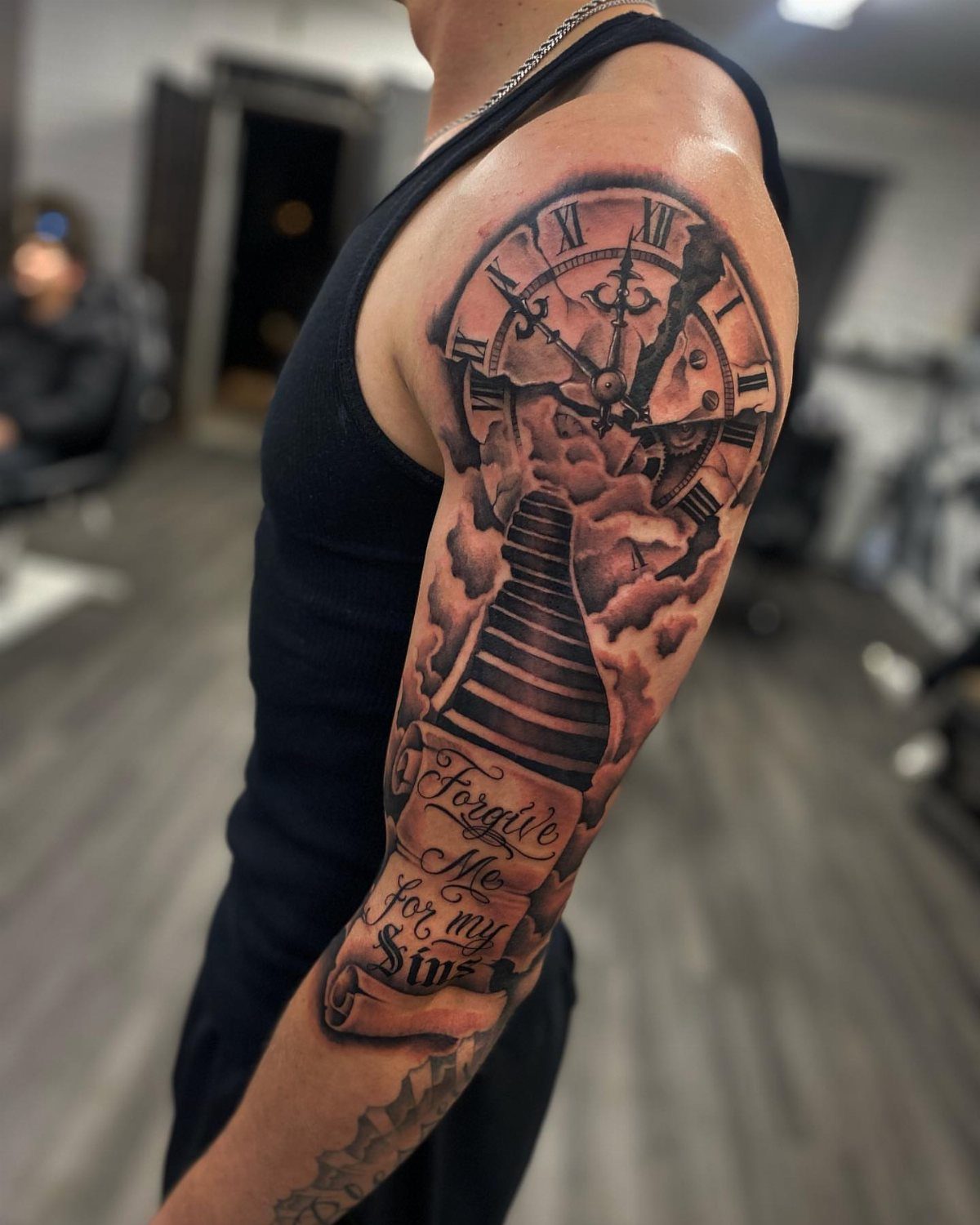
A shattered clock fits 2 moods: feeling stuck, or wanting out from under the schedule. Pair it with a second element that points somewhere, and the piece stops being only about being stuck.
Keep the scroll text brief, since it has to stay legible beside the broken glass.
4. Melting Clock Tattoo
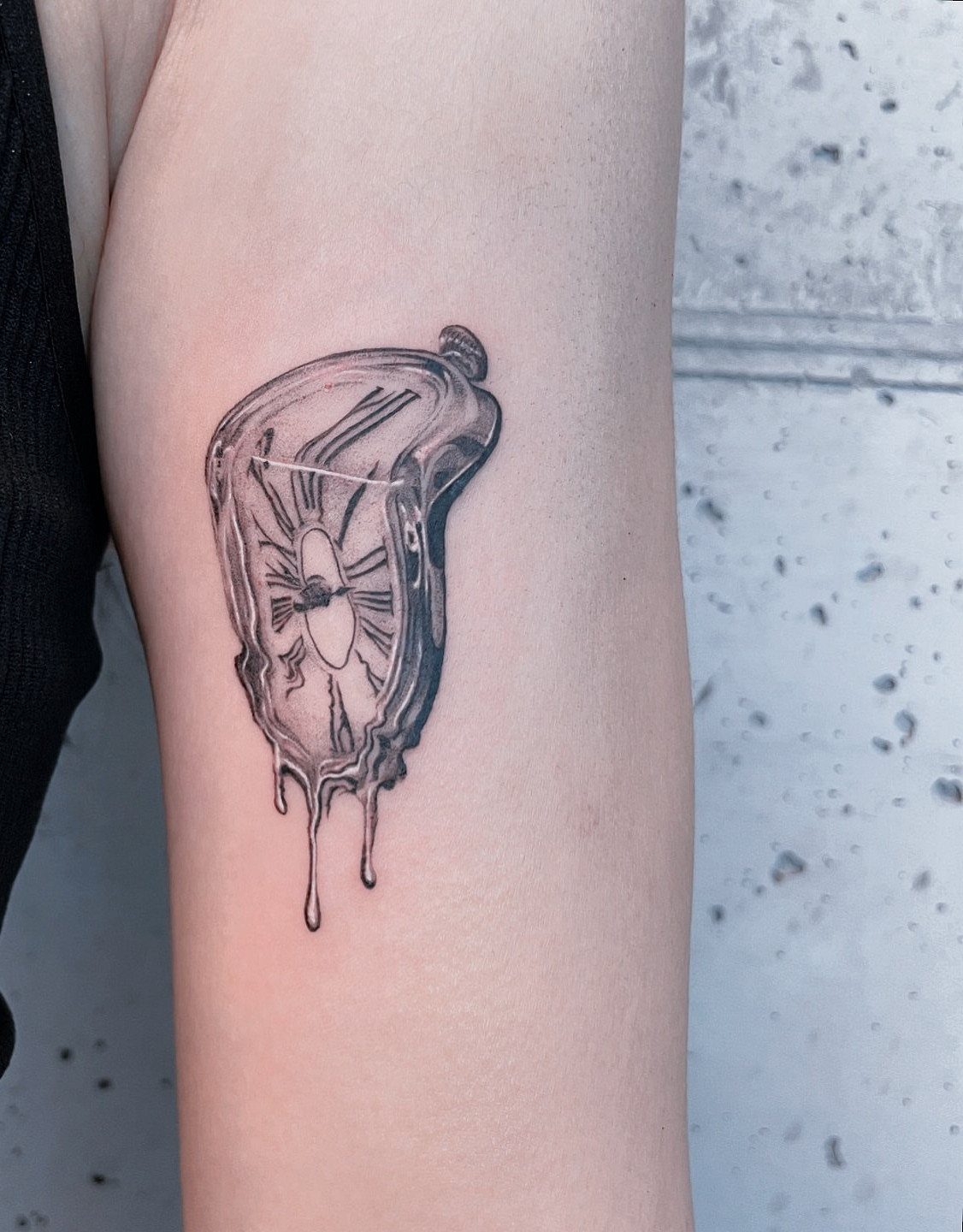
Dalí’s soft, drooping watches are the source, and the idea is time ruling people instead of the other way around. The dripping edges do the work, so the clock needs to sag convincingly.
I would keep it black and grey, as this one is.
Smooth shading sells the limp, wax-like look better than heavy outlines. The upper arm works well because the curve of the muscle helps the clock appear to hang and slump.
Choose an artist whose portfolio shows clean gradients.
5. Time Is Money Tattoo
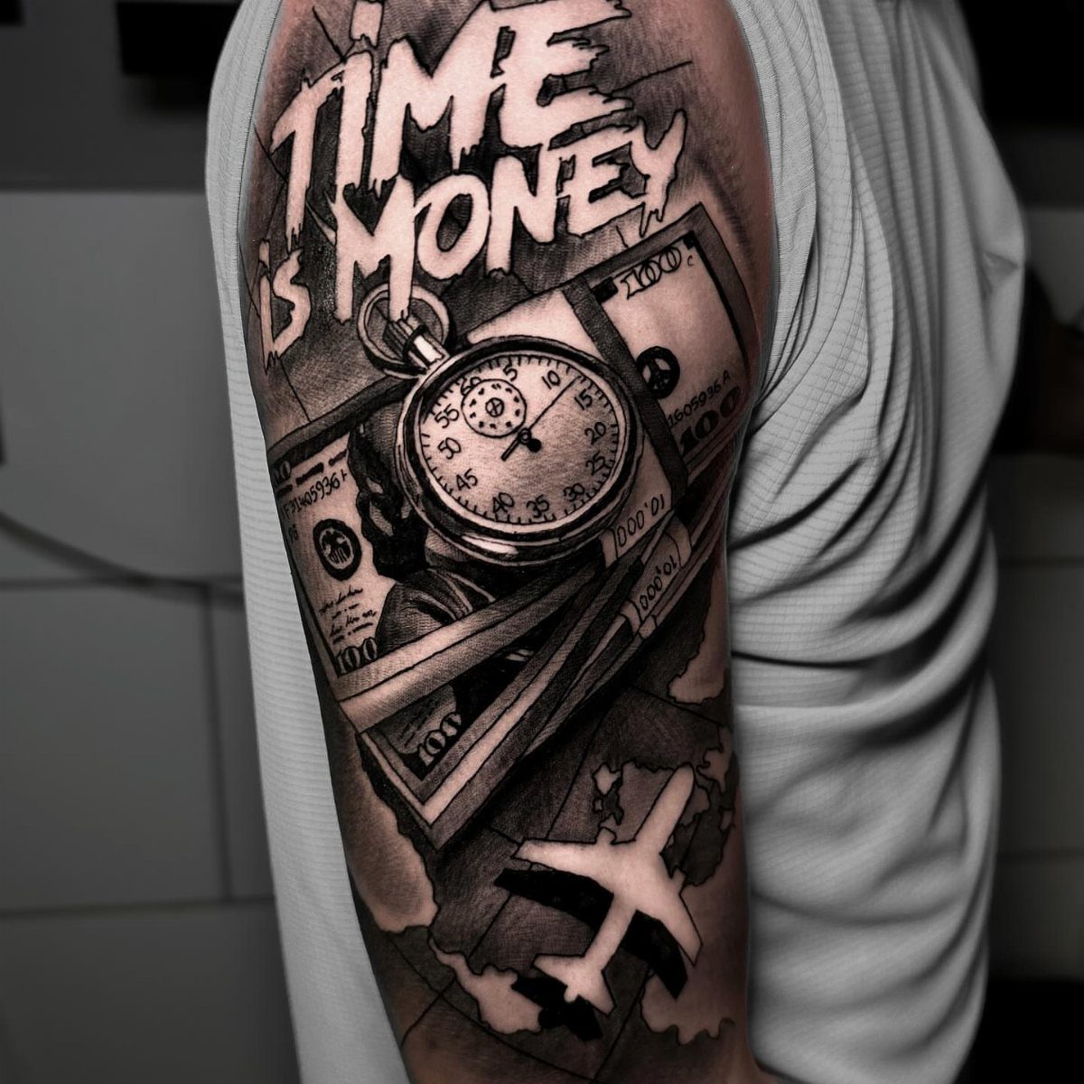
This is a statement piece for someone whose calendar runs their life. A pocket watch, cash, and the words "TIME IS MONEY" say it plainly, with no hidden meaning to decode.
The trade-off is that a slogan is fixed to who you are right now.
If your view of work might shift, I would keep the text small and let the watch lead. Black and grey ages calmly, and an upper arm gives bold block capitals enough width to stay sharp.
6. Time Waits for No One Tattoo
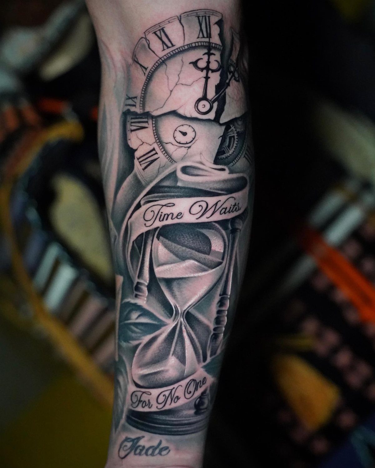
Pairing a cracked clock with an hourglass makes the warning twice over: time is both breaking and running out.
"Time Waits For No One" is a familiar line, and a name tucked in, like Jade here, turns it into a reminder of who you spend time on.
If you add a name, give it its own spot instead of crowding the lettering. I would set the phrase in one clean line, then place the name below it, so each part reads clearly on the arm.
7. One Day at a Time Tattoo
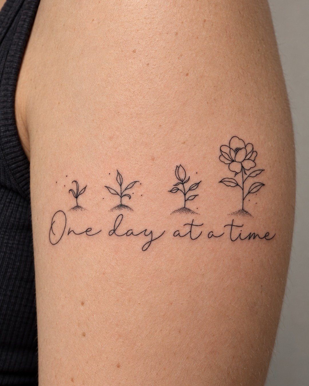
Growing stages say what the phrase says: progress comes in small steps. A flower drawn in stages above cursive text turns "One day at a time" into a sequence you can read left to right.
I would keep the script short and fairly large, since cursive loses its loops first as skin ages. The upper arm gives the flower stages room to sit in a clean row without crowding the line beneath them.
If the phrase is a recovery mantra or just a daily reminder, the design works the same way.
8. Time Piece Tattoo
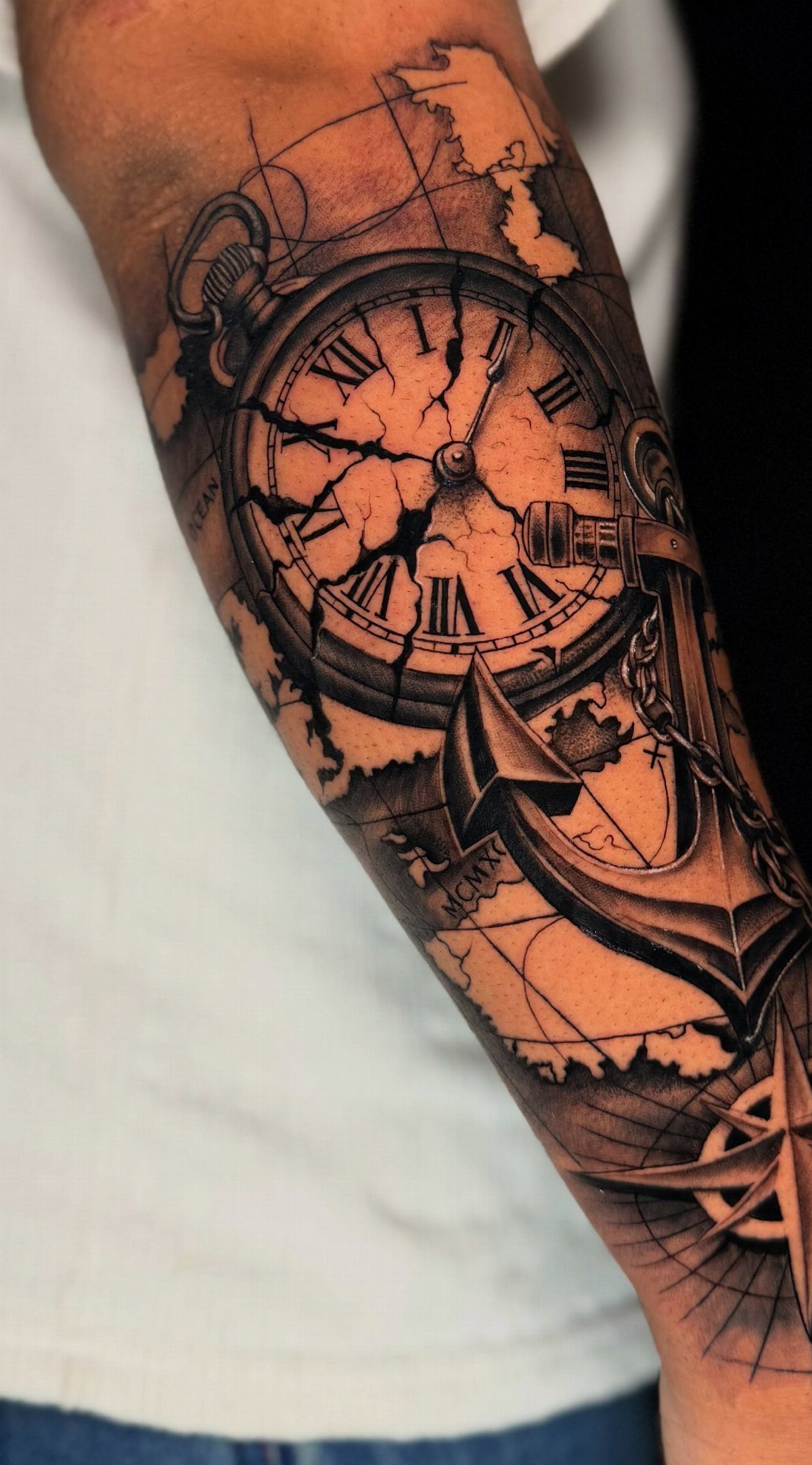
A cracked vintage pocket watch reads as timelessness with a flaw in it, and pairing it with an anchor and a map adds direction and staying power. Together they suggest a person who is grounded but still traveling.
I like this one in black and grey, where the shading carries the depth of the dial and the numerals stay crisp as the tattoo ages.
On a forearm, the watch should be the largest element, with the anchor and map supporting it so the cracked face stays readable.
Ask your artist how the crack lines will be spaced, because thin fractures packed close together can blur into a smudge.
Meanings of Time Tattoos
A time tattoo means whatever you decide it means, and that is its strength. Some people wear it as a reminder to cherish each moment and live fully.
A third reading is about hard stretches: a nod to getting through tough times and how they shape you. Pick the meaning first, then let the design follow it.
A clock also has weight of its own, since people have been building devices to track the hours for thousands of years.
Its passing is the one constant in life, and that idea works in any style, so the design adapts easily to a custom piece.
Time tattoos offer a unique way to reflect on the passage of time, highlight its significance, celebrate milestones, or even appreciate its fleeting nature. Whether you prefer vintage clock pieces or symbolic phrases, time-themed tattoos blend artistry and meaning.
Best Placements for Time Tattoos
The round shape of a clock fits both small and large tattoos. For something small, the wrist or inner forearm is the usual choice.
For a bolder statement, I would build a full sleeve around clocks, with time as the single theme tying every piece together.
That gives you room for extra elements, and I would plan the whole sleeve with your artist before the first session.
Flowers pair well with clocks. Cherry blossoms, daisies, roses and sunflowers all work, and a birth flower turns the clock into a birth tattoo.
Watch the size on a wrist. Roman numerals get fuzzy fast when the dial is small, so I would size up before giving up the numerals.
Frequently Asked Questions
What are some good sayings for tattoos about time?
"Time Waits For No One" and "One day at a time" both work well. A cracked clock and an hourglass make a natural match for the first saying, since both show time breaking apart and running low.
What is the significance of a clock tattoo?
A clock tattoo stands for the passage of time and how fleeting life is. Some people give the clock a private meaning instead, with the hands set to a birth time or the date something changed their life.
How big should a clock tattoo be so the numerals stay readable?
Roman numerals blur quickly on a small clock, so give the dial real room.
On a wrist, I would size the clock up before I would give up the numerals. A forearm has the space to keep them readable for years.
What colors work best for a time tattoo?
For most time designs, I pick black and grey. It ages calmly, keeps numerals crisp, and lets smooth shading carry the depth of a dial or the limp, wax-like sag of a melting clock.