Your available skin decides which of these god inspired tattoos fits: a single cursive word like "Jesus" or a short line like "Child of God" sits on a wrist and asks for almost no space, while the Armor of God sleeve needs most of an arm.
Between those extremes sit the scripture tattoos, floral crosses, angels and doves, and the busier the design, the more skin it needs before the lines start to blur together.
Thin script is the other limit, since fine lines soften with age, so I’d size small words like "tetelestai" up rather than down.
1. Cross Tattoo
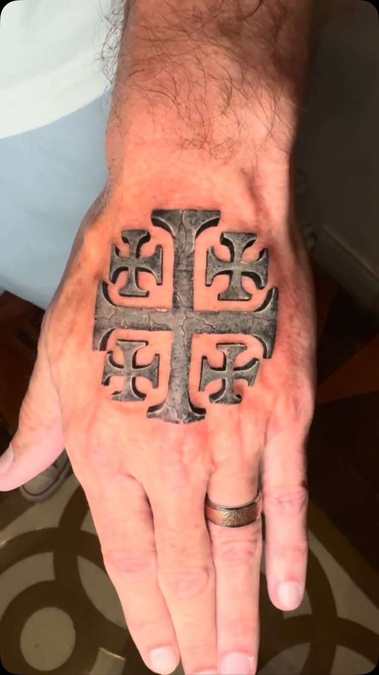
A Jerusalem cross on the back of the hand is a bold choice, and the stone texture is what makes it work.
Shading that mimics carved rock gives the symbol weight and depth, so it reads as an object rather than flat lines.
The hand is a high-visibility spot, so I’d decide first whether you want it seen at every handshake. If you do, this is a strong, classic way to say it.
2. Scripture Tattoos
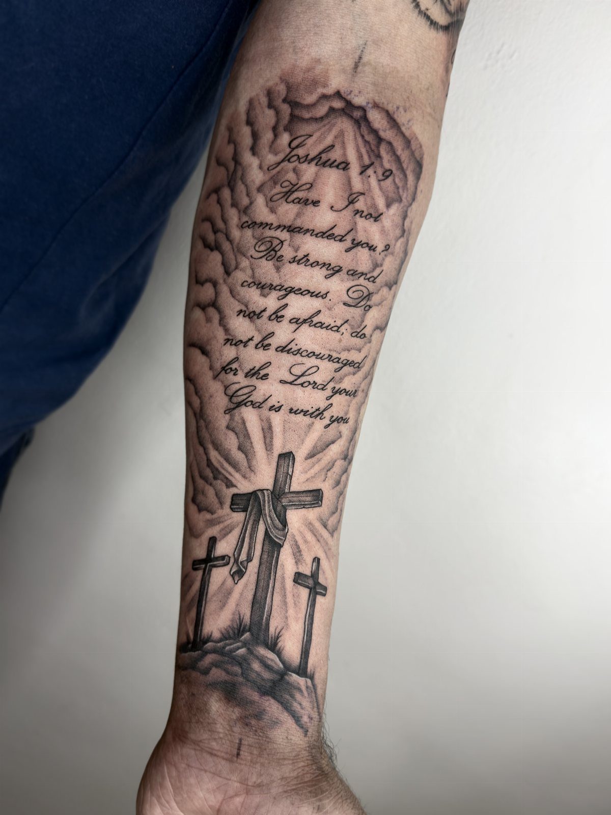
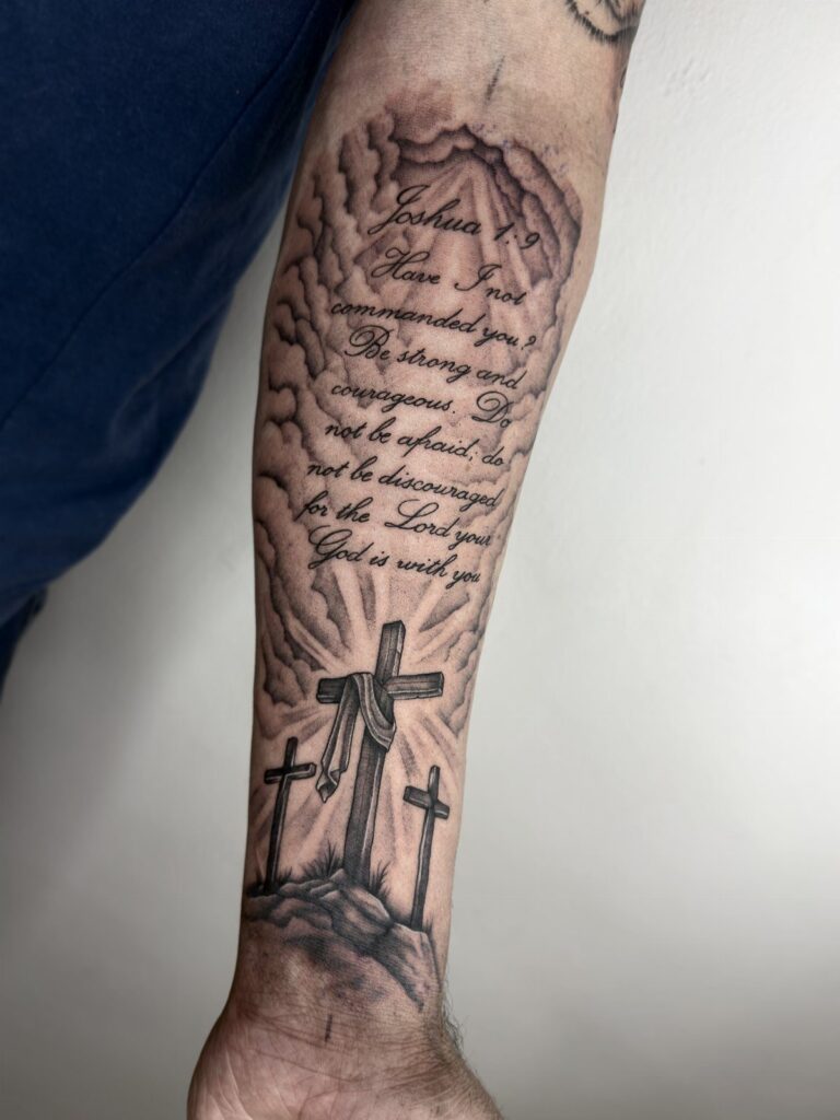
Joshua 1:9 above three crosses on a hill is a layout I’d copy: the verse sits in its own band, and the crosses carry the image underneath. On a forearm, that stacked arrangement uses the long, narrow space well.
Pick a verse you could recite from memory, since you’ll read it for decades. Keep the lettering large enough to stay legible as the lines soften with age, and proofread the reference number before the stencil goes on.
3. Angel Tattoos
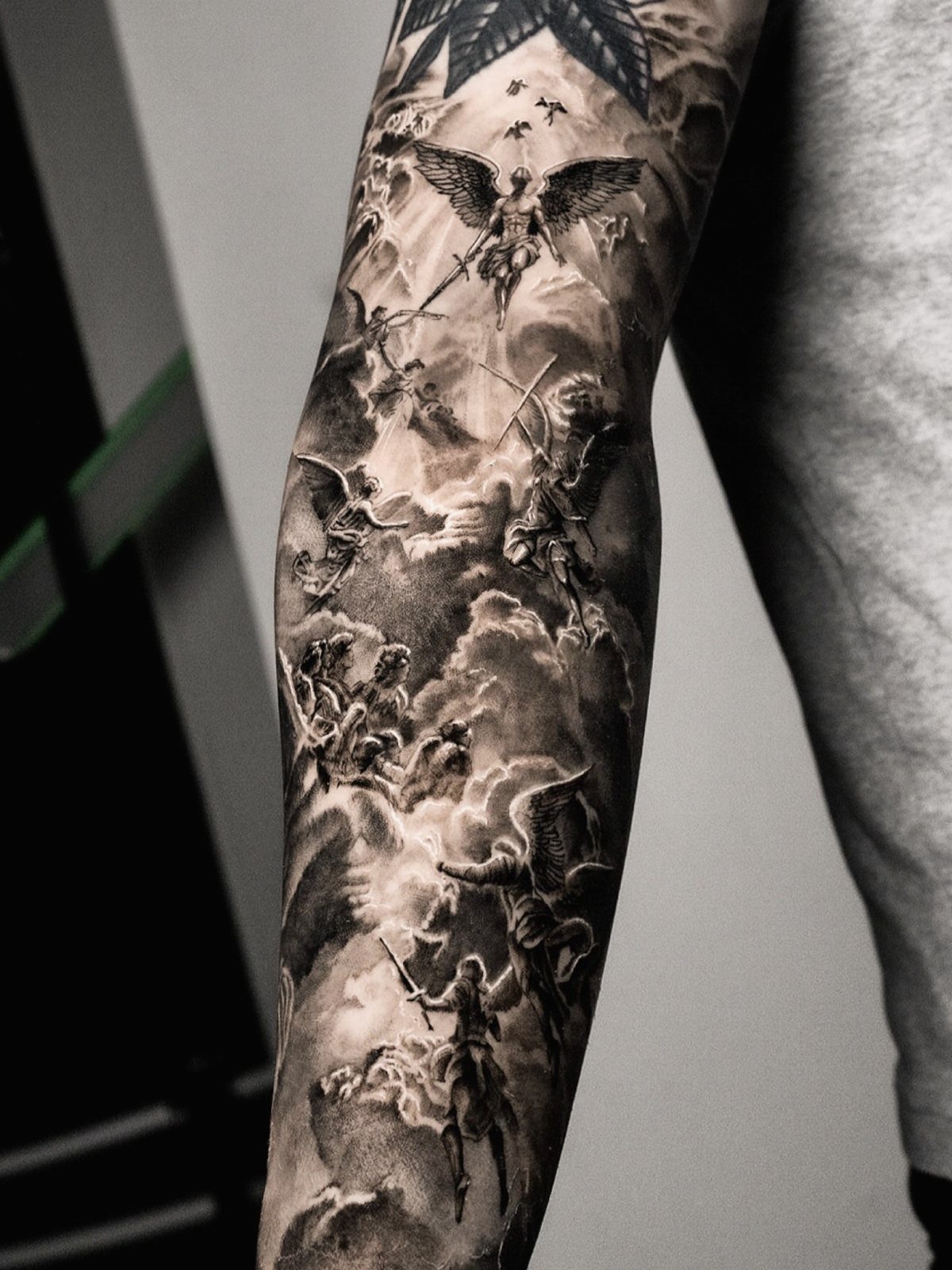
Angels with raised swords read as guardians, not decoration, and that is the version I’d choose for a protection theme. Wings, blades and clouds all give an artist room for strong contrast in black and grey.
Because these designs hold many small figures, they need space. A sleeve gives them space to spread out; squeezed onto a small patch of skin, the wings and swords would blur together.
4. Dove Tattoos
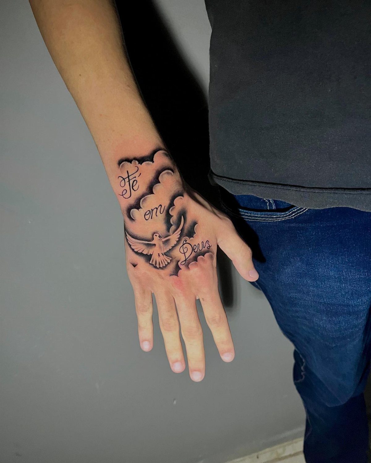
Dove tattoos suit people who want peace and the Holy Spirit in a small, quiet design.
Here a dove, soft clouds and the words "Fé em Deus" wrap the hand and wrist, so the text can carry your own language and faith.
If you add words in another language, have a fluent speaker check the spelling and accents before you commit. One missing mark is permanent.
5. Black Ink, Cursive Script Text Reading "tetelestai" on the Upper Arm
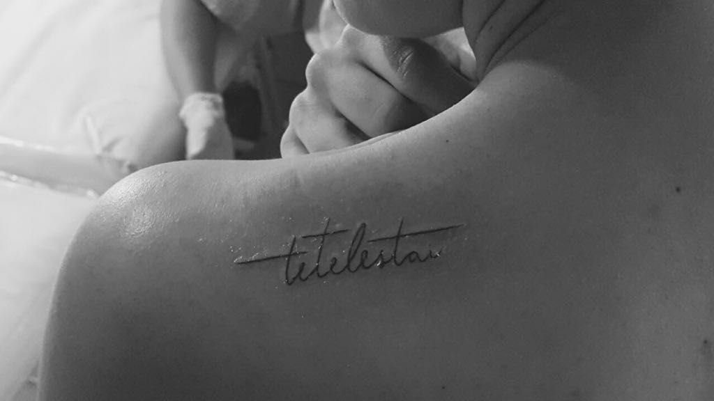
"Tetelestai" is Greek for "it is finished," and a single word in cursive needs no image to say it. Set in black ink across the upper arm and shoulder, it stays understated and a sleeve hides it without any fuss.
Script lives or dies on the artist’s hand, so ask to see healed lettering before booking. Smooth, even letter spacing matters more here than any decoration.
6. Floral Cross Tattoos
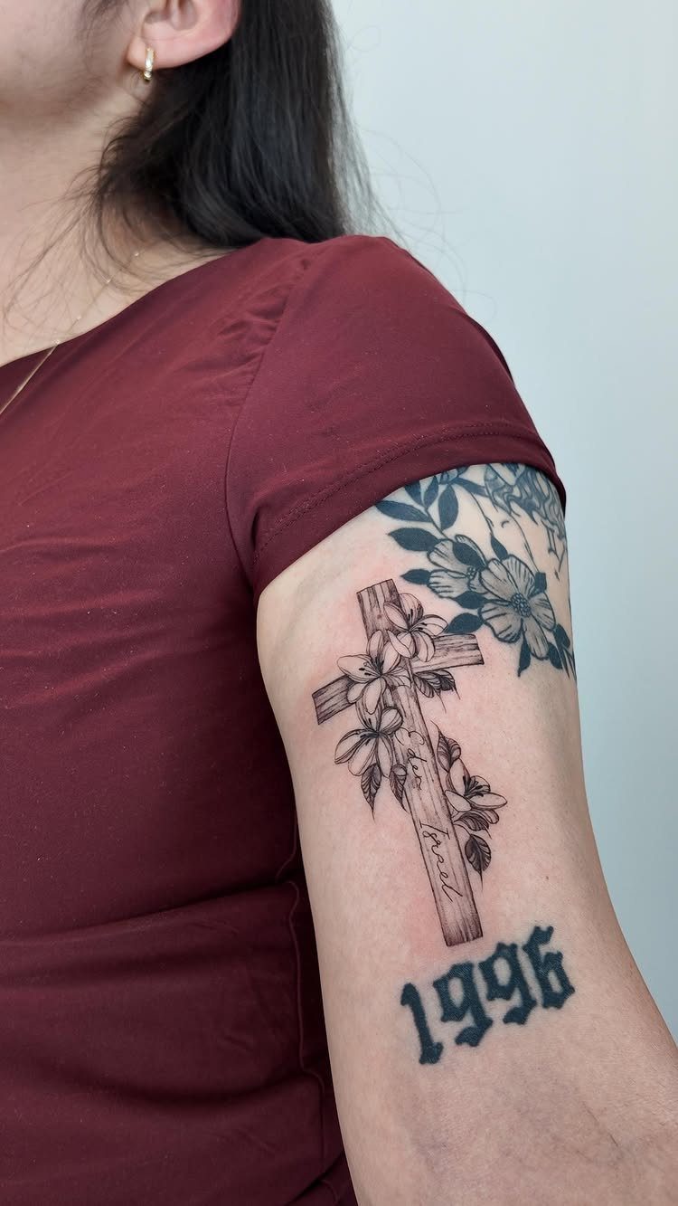
A wooden cross wrapped in flowers softens a heavy symbol, and I like it for readers who want faith with some gentleness.
The upper arm gives it room to include small personal details, like the words "The Gospel" and a year, here 1996.
Adding a date makes the piece yours alone. Choose one that matters to you, and keep the text small so the cross stays the focus.
7. Armor of God Sleeve Tattoo
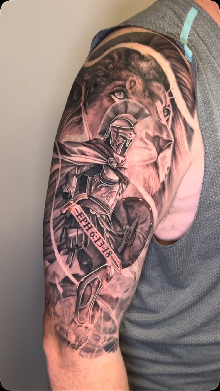
Ephesians 6:13–18 is the passage behind this design, and a Roman soldier paired with a lion gives a sleeve its backbone.
Black and grey suits the metal and fur textures, and the scripture reference in small capitals keeps the text from fighting the figures.
The maker says this piece was done in 2 sessions, which is a useful benchmark if you’re planning a sleeve.
Get a realistic session count from the artist before you commit, and decide early whether the verse goes on the sleeve at all.
8. Child of God Tattoo
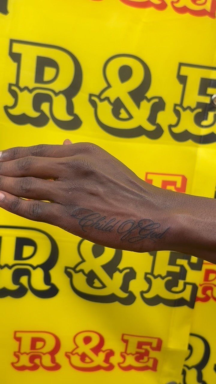
"Child of God" in cursive across the wrist is short, readable and easy to tuck under a cuff or watch. I’d size the lettering slightly larger than feels necessary, because thin script softens with time.
The words are plain, so the quality of the handwriting carries everything. Choose a script with open loops and even spacing, and look at the stencil on your wrist before any ink goes in.
9. Cursive Jesus Wrist Tattoo
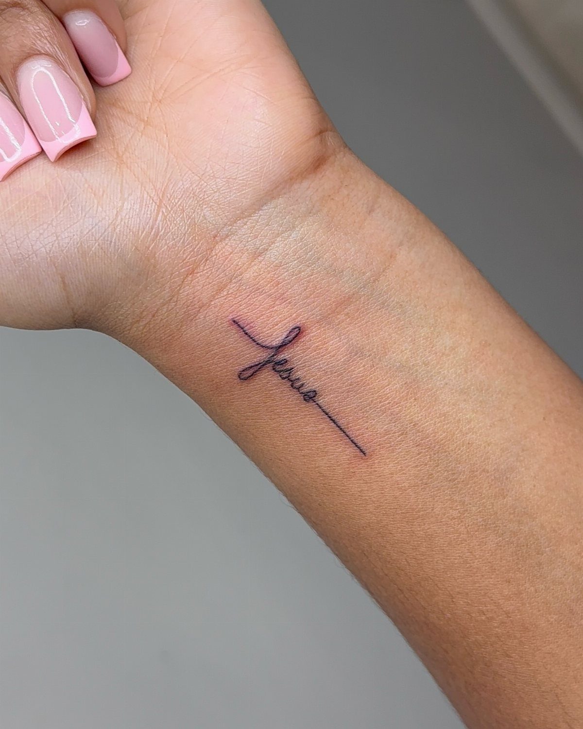
A single word, "Jesus," in thin cursive along the inner wrist is about as quiet as a faith tattoo gets. It asks for very little space and reads clearly at a glance.
Fine lines are the trade-off: they can blur and fade faster than bold ones, so I’d go a touch thicker than your first instinct.
Pick a script with simple letterforms, and have the artist test the placement so the word sits straight when your hand is relaxed.
Placement Ideas
Placement decides how a tattoo lives day to day. The wrist and forearm are easy to show or cover, while the shoulder and ribs stay private unless you choose otherwise.
Ribs are the spot I’d think hardest about, since a tall vertical layout fits the side of the torso well.
Ask the artist to place the stencil while you stand and while you sit, because skin shifts and straight lines can bend.
If you work somewhere with a dress code, pick a spot a sleeve or cuff covers.
Tattoo Styles
Style should follow the size of your spot. Minimalist and cursive pieces suit small areas, and they stay clean if the lines are not too thin.
Realistic work, like clouds and sun rays in grey-scale, needs room for smooth shading, so it belongs on a forearm or larger. Floral designs fall in between and scale up or down well.
I’d choose one dominant style per piece. Mixing a realistic cross with a decorative script can work, but only when the artist plans the contrast on purpose.
Meaning Behind Tattoos
A faith tattoo works best when the meaning is yours, not borrowed.
Philippians 4:13 stacked under sun rays, clouds and three crosses reads as strength; "trust in god’s time" beside a sunburst reads as patience. Same imagery, different message.
Decide which message you need to see in the mirror, then build the design around it. A red accent in a black and grey piece can mark the line you most want noticed.
Write your reason down before the consultation. Artists draw better when they know what the piece is for.