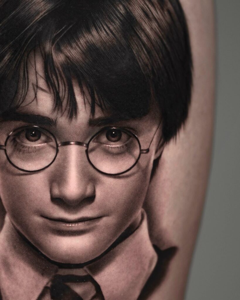
The ideas here run from the ‘Always’ quote, which is the cheapest to plan since there’s no artwork to draw, to the Harry Potter portrait, Hermione and Sirius Black, where the artist’s skill decides everything.
The spot on your body should pick the design: a narrow forearm and a wide thigh want different shapes, and the Hogwarts crest with its animal symbols and Latin motto turns to mush if you shrink it to fit a small space.
1. Dobby the House-Elf
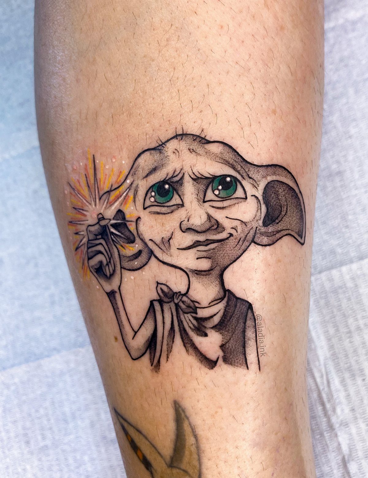
Dobby works well as a leg piece because his long limbs and big ears give the design room to breathe. Keep the wand and the green eyes legible, since those details tell people who he is at a glance.
Small sparks add movement, but crowd them and they blur. I’d leave a little empty skin around the figure so the linework stays clean as it ages.
2. Always’ Quote Tattoo
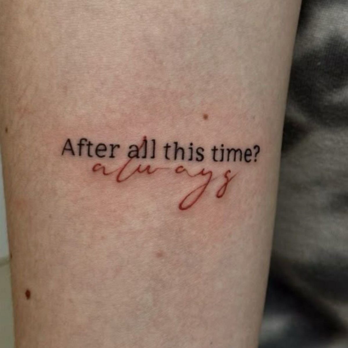
Two lines of text, one in black print and one in red script, make this the cheapest idea on the list to plan. No artwork to draw, just lettering.
I like the contrast: the print reads as the question, and the red cursive "always" lands as the answer.
Pick a script with open loops, because tight cursive tends to fill in over the years. Text this size also suits nearly any flat stretch of skin, so placement stays flexible.
3. Deathly Hallows
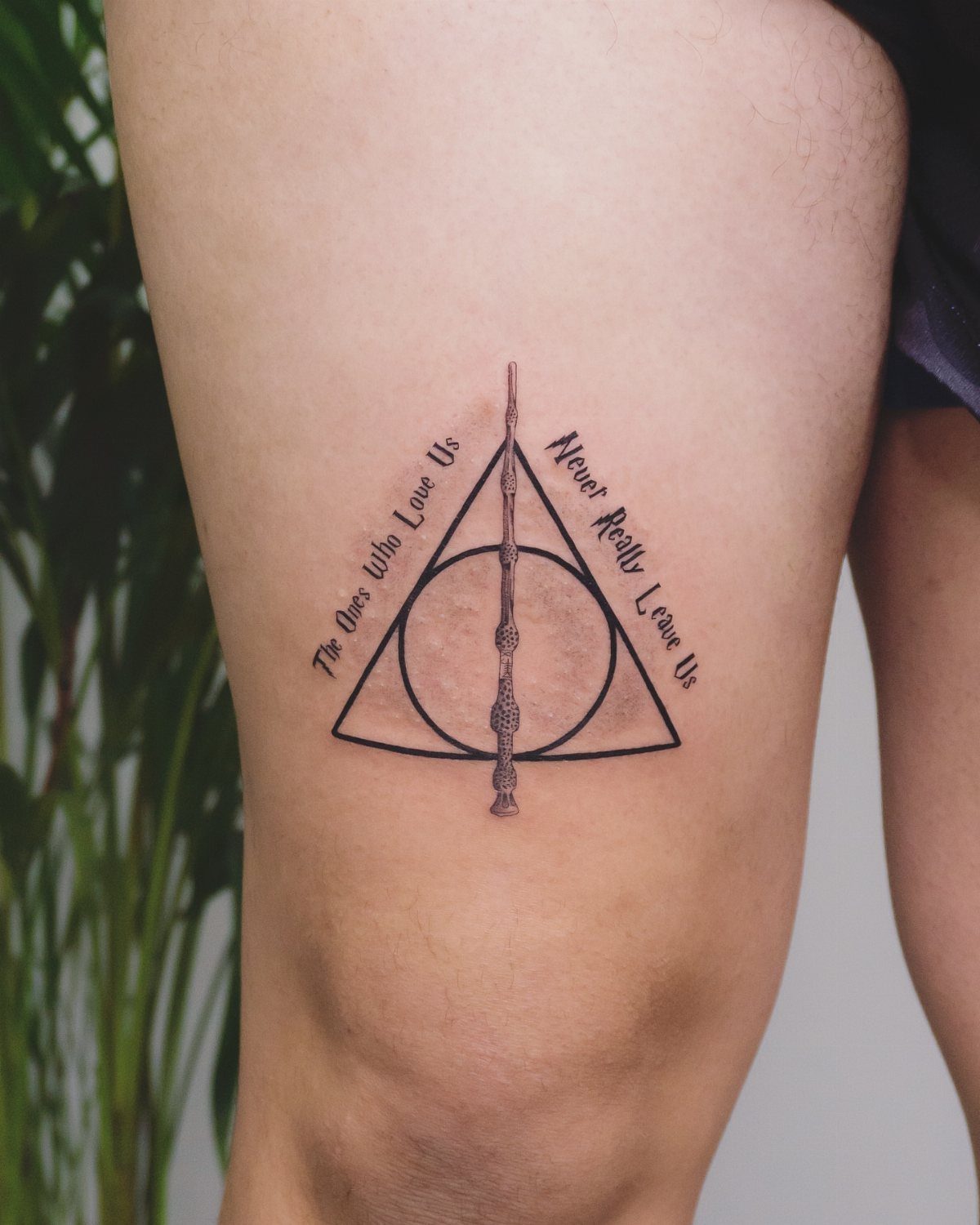
A triangle, a circle and a line stack into one symbol, which is why the Deathly Hallows shrinks down so well. Fine lines hold up at small sizes if you keep the 3 shapes well spaced.
A line of script beside the Deathly Hallows symbol gives a thigh piece enough length to carry both.
For something quieter, the bare symbol alone is a fine choice. I’d pick the quote version for the personal meaning it carries.
4. Hogwarts Crest
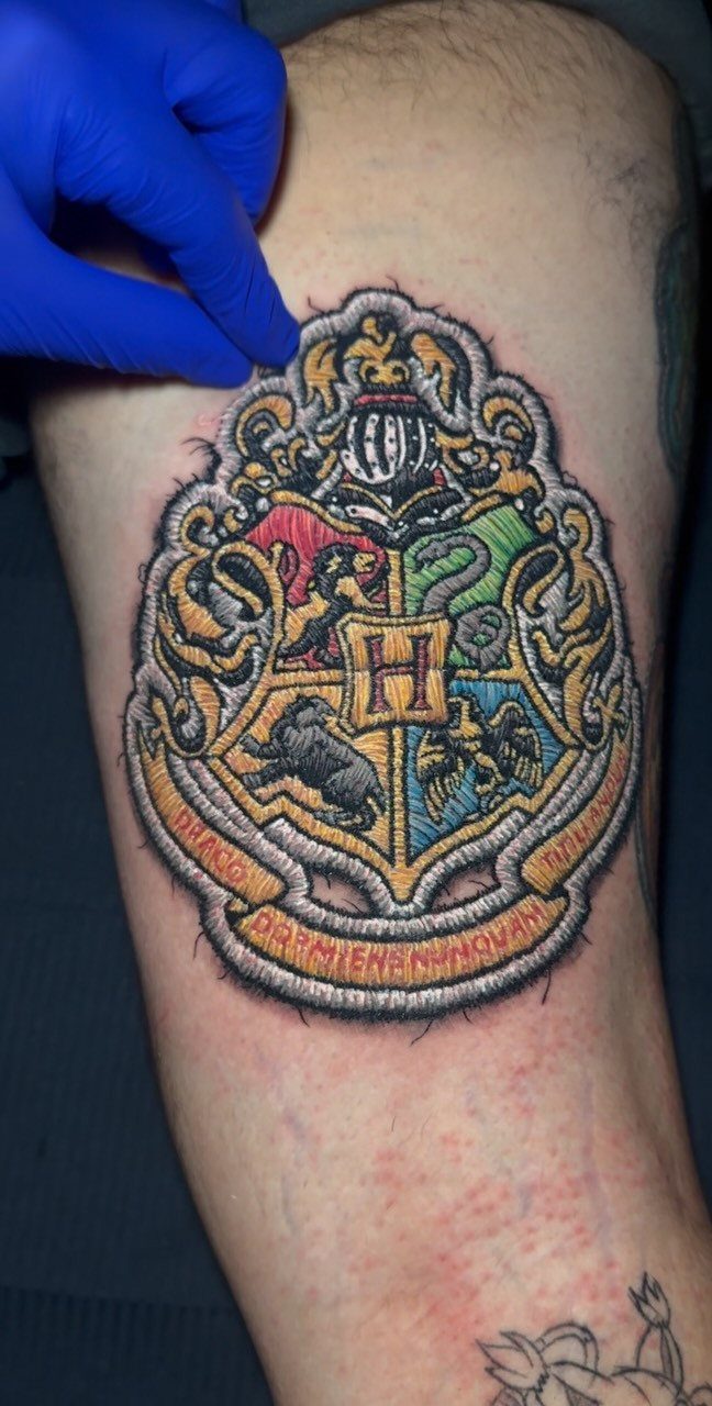
Four houses, one shield, and a central H: the crest is the most detailed design in this group, so size matters. Go too small and the animal symbols and Latin motto turn to mush.
Plan on a calf or thigh, where there’s space for color to stay distinct between sections.
Expect a longer session than a wand or a symbol would need. If you can’t pick a house, this is the one design that doesn’t make you choose.
5. Expecto Patronum Spell Tattoo Alongside a Wand
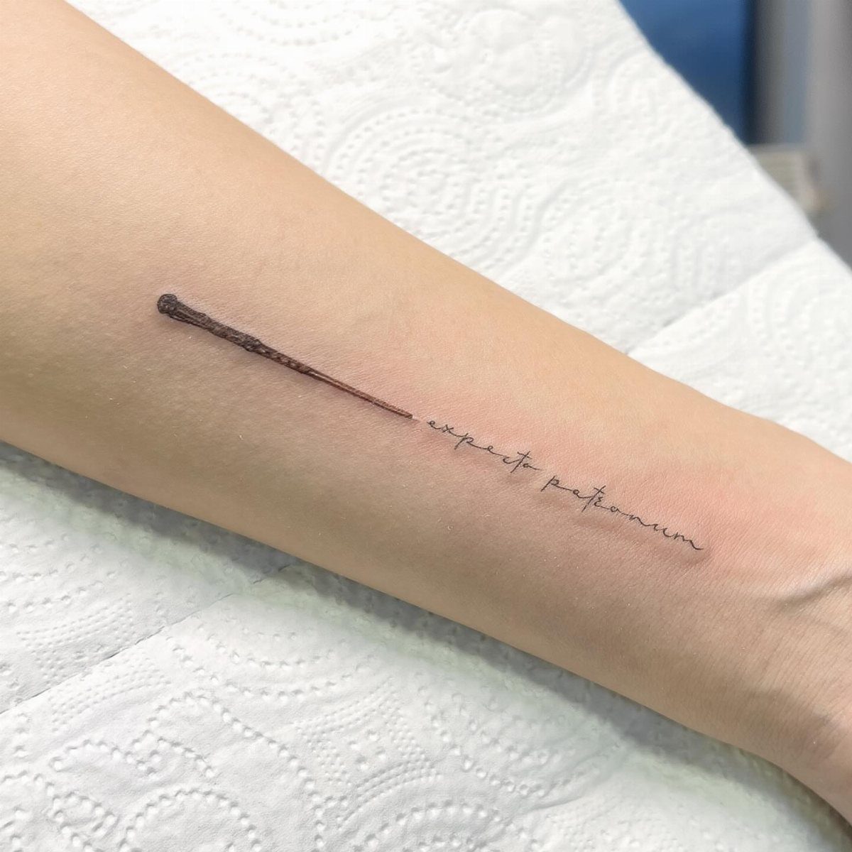
Spell text paired with a wand gives you a vertical shape that follows a forearm naturally. The brown wand adds a bit of color and grain without needing a big design.
Cursive "expecto patronum" is easy to misspell, so check the lettering on the stencil before the needle starts.
A small stag or doe could be added near the wand later as a separate piece, though I’d keep it simple for now.
6. Sorting Hat
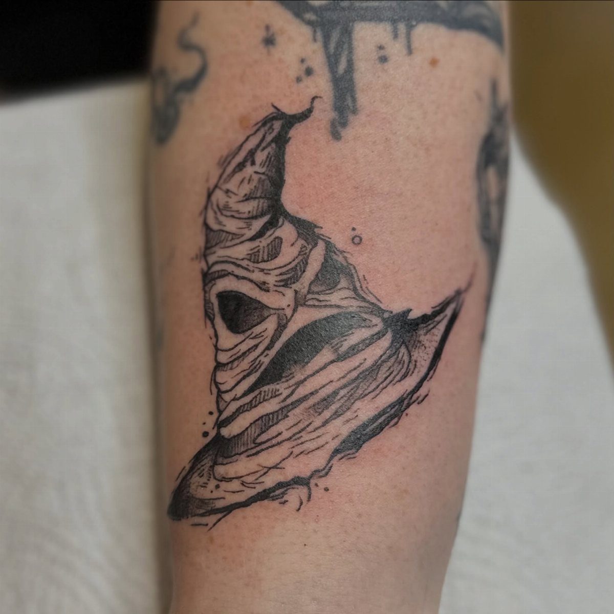
Black ink alone suits the Sorting Hat, because its folds and creases are all about shading. That keeps the design cheaper and simpler than a color piece, and it ages well.
Choose an artist who shows soft, smooth gradients in their portfolio, since the wrinkled fabric depends on them.
The forearm gives the hat a good size to hold that detail. I’d skip going tiny, as the folds would run together.
7. Platform 9 ¾ Circular Sign Tattoo
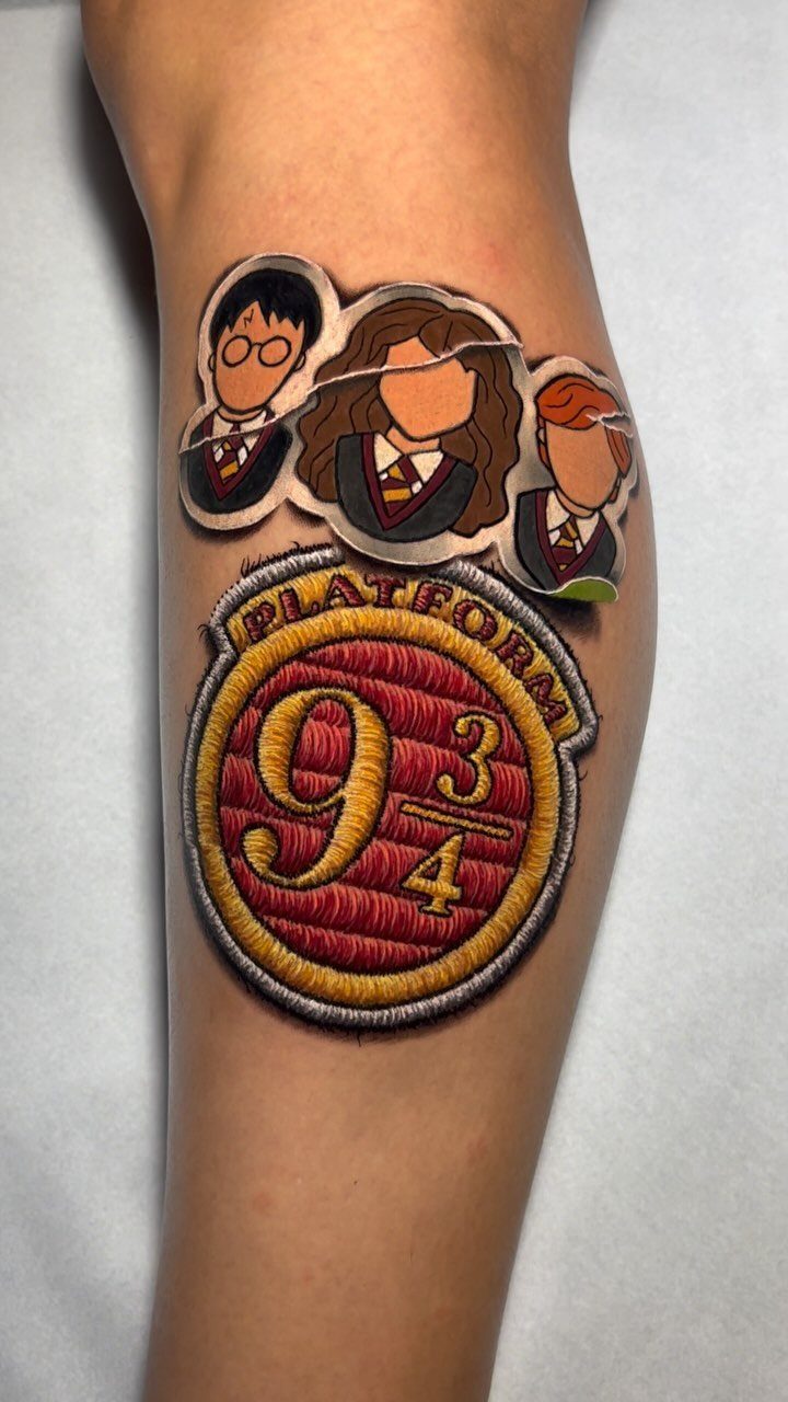
A round sign suits a tattoo because the circle gives the lettering a frame, and "PLATFORM 9 3/4" stays readable when the characters around it are cartoon-sized.
Keep the numerals thick and well spaced, since thin digits are the first thing to soften with age.
The leg gives this design room for the 3 figures without crowding the text. I’d keep the sign itself larger than the characters, because it’s what people recognize first.
8. Felix Felicis Potion Bottle Tattoo
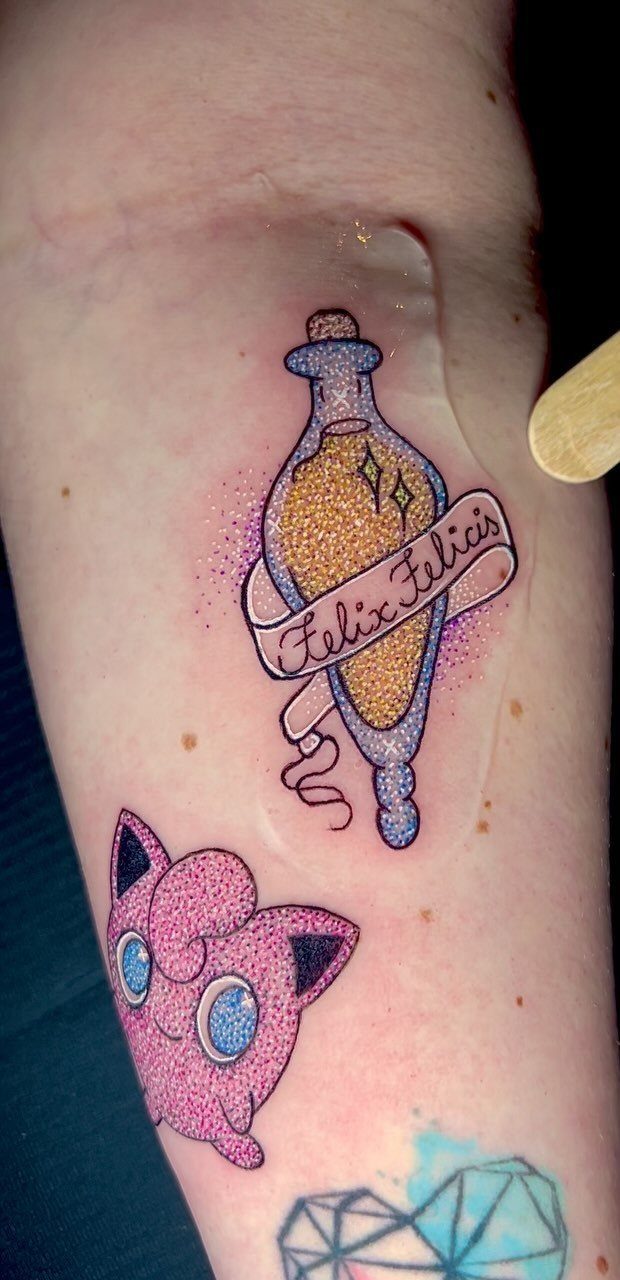
A potion bottle with golden liquid and purple sparkles is a luck charm you can wear, and the bottle shape makes a neat vertical fit for an upper or lower arm.
Label lettering is the weak point: "Felix Felicis" needs to be large enough that the letters don’t close up.
Color is part of the appeal here, so go with an artist who shows saturated gold in healed work. I’d leave space around the sparkles so they read as separate points.
9. Time Turner
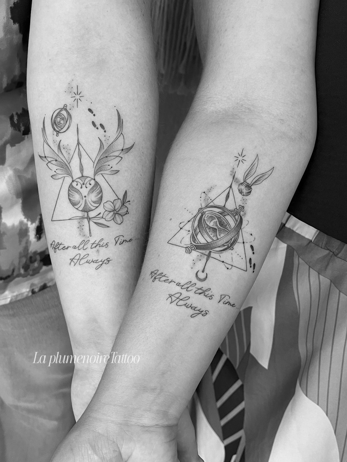
Time Turners pair well with a line of script, and "After all this time…
Always." turns an object into a quote. Black ink only keeps it simple, and the tiny hourglass details need careful, steady linework.
Matching forearms are a good way to carry it: one holds the Time Turner, the other the lettering.
Don’t shrink the hourglass too far, or the chain and sand will blur. For a single Harry Potter tattoo, I’d pick the Time Turner and add the words below it.
10. Triwizard Cup
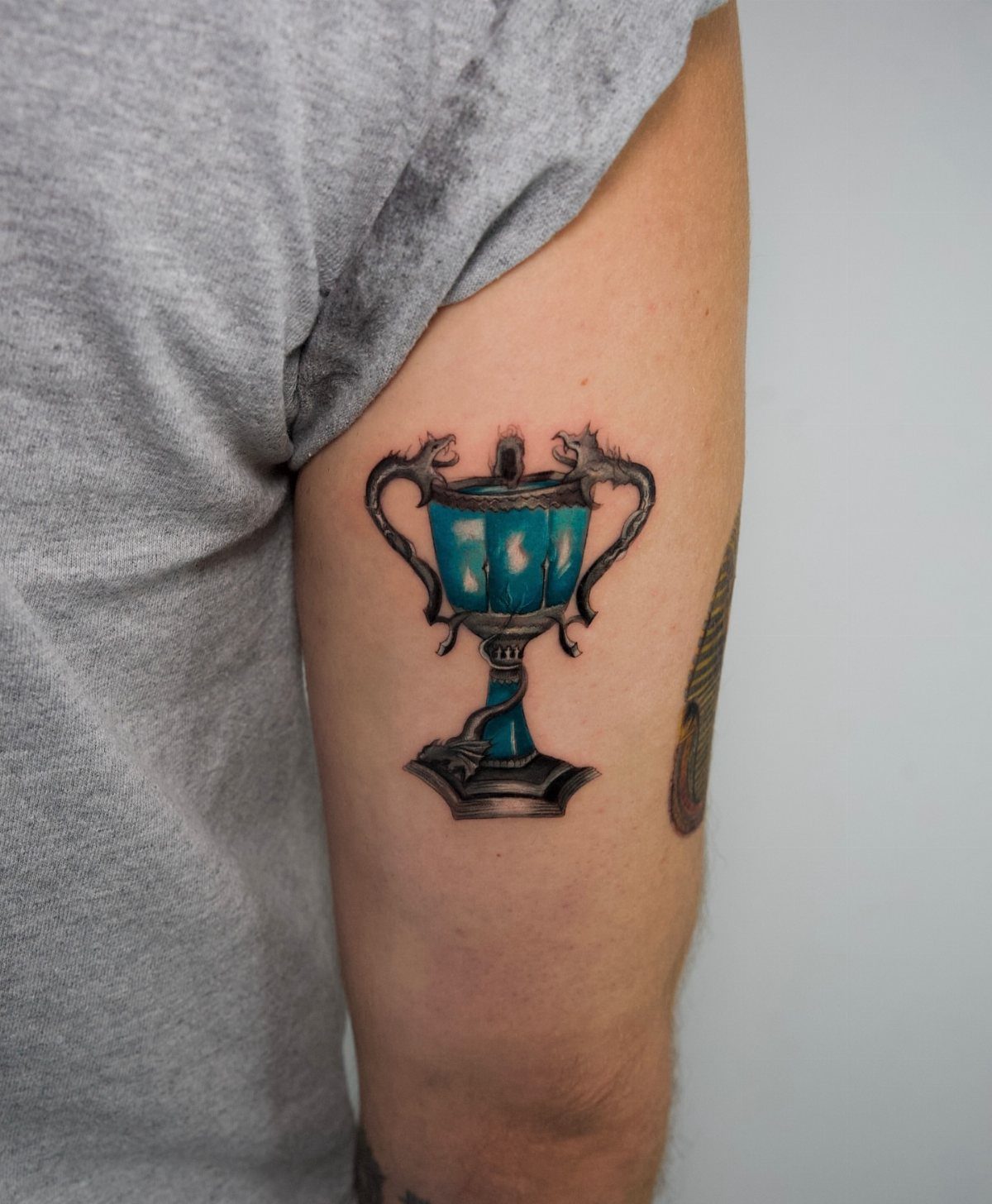
Blue and silver with dragon handles makes the Triwizard Cup a strong upper arm piece, tall enough to show the handles clearly. The glowing blue center is the focal point, so give it clean contrast against the silver.
Color work like this takes longer than black linework, so expect more than a quick sitting. I’d skip any shrinking of the handles, since the dragons are what separate this cup from a generic goblet.
11. The Dark Mark
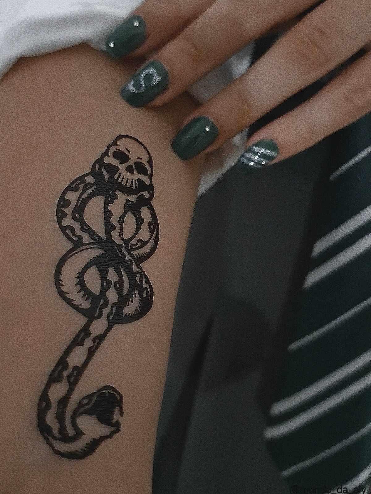
Skull and snake, in black ink alone: the Dark Mark needs no color, which keeps it one of the more affordable designs to plan.
The snake’s curve through the skull’s mouth is the detail to protect, so don’t let the artist crowd it.
Bold black lines hold up best here. The inner forearm is a classic spot, and I’d size it big enough that the scales on the snake stay visible years from now.
12. Harry Potter Portrait Tattoo
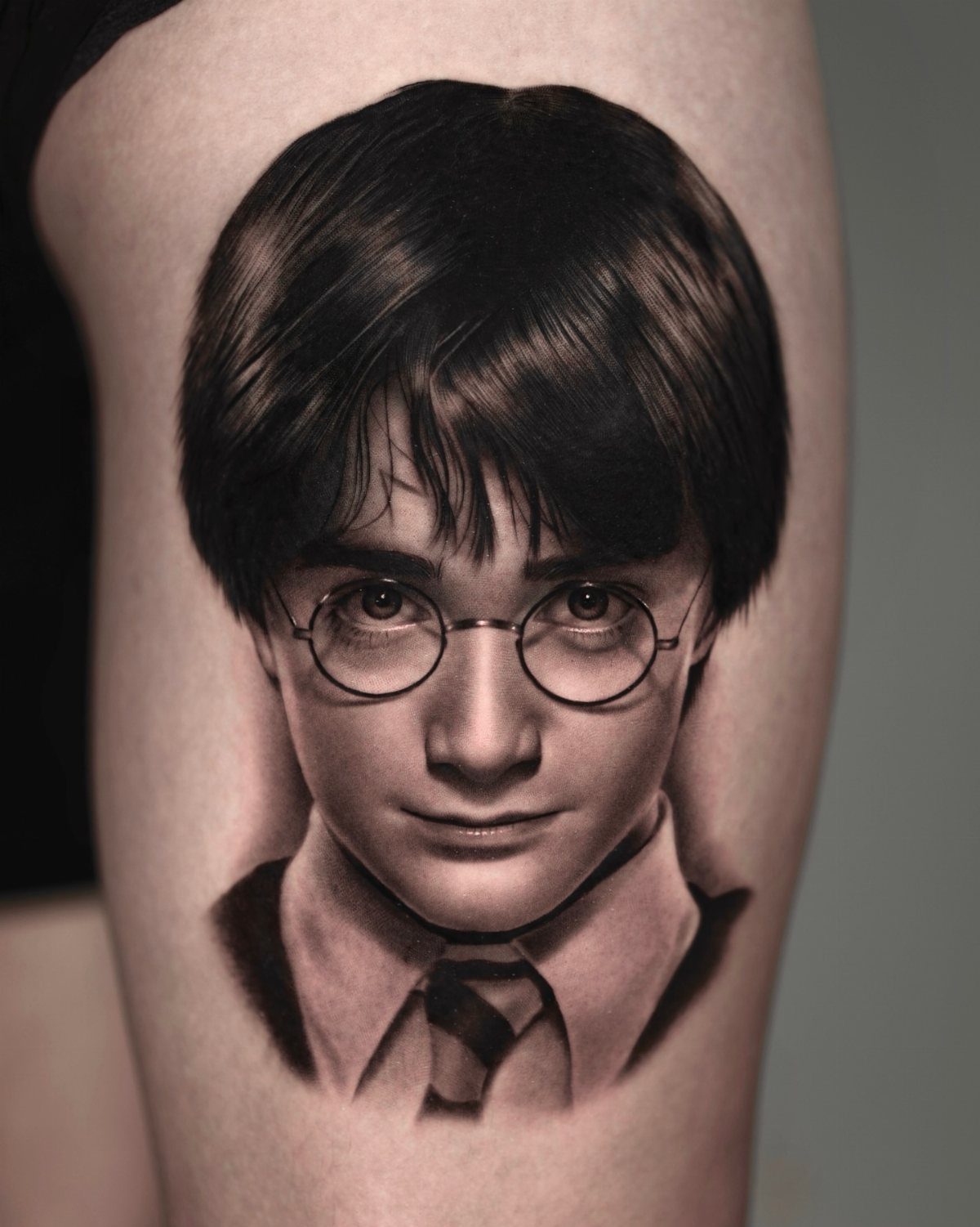
A realistic black and grey portrait of young Harry, glasses and school uniform included, depends on the artist more than any other Harry Potter design. Faces are unforgiving; a slightly off eye or glasses frame reads as someone else.
Study portfolios for healed likenesses, not fresh photos.
The arm gives enough size for the shading to work. I’d pay more for the right artist than save money on a cheaper one.
13. Owl and Hogwarts Quote Tattoo
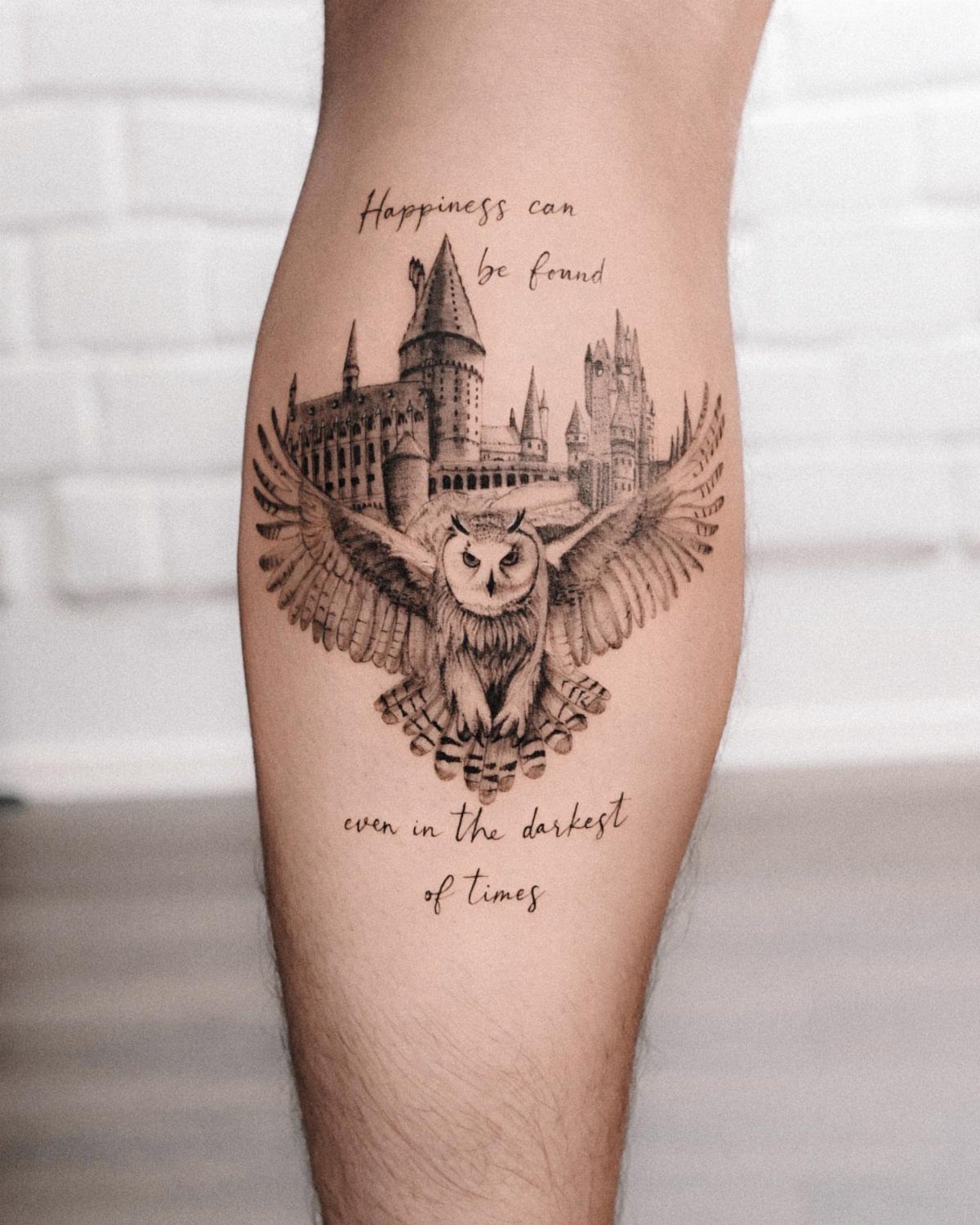
Owl, castle and a full sentence in one piece ask a lot of an arm, so give it height.
"Happiness can be found even in the darkest of times" is long, and the letters only stay open if the lines are set larger than feels necessary.
Black and grey keeps the cost down and ages well. I’d have the artist stencil the quote first, then fit the owl and castle around it, not the other way round.
14. Hogwarts Castle on Floating Island
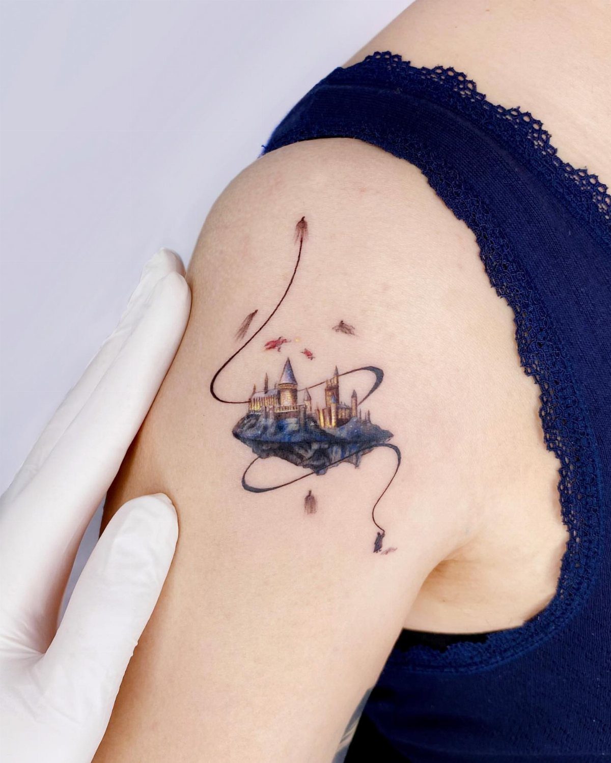
Swirling lines around a floating island give the castle a sense of lift, and the small birds add scale without much extra work. An upper arm has the curve to carry that motion.
Black ink only is enough here.
Keep the swirls spaced apart, since lines packed tight around the island will merge as the tattoo softens. I’d pick this over a flat castle for the movement alone.
15. Hermione
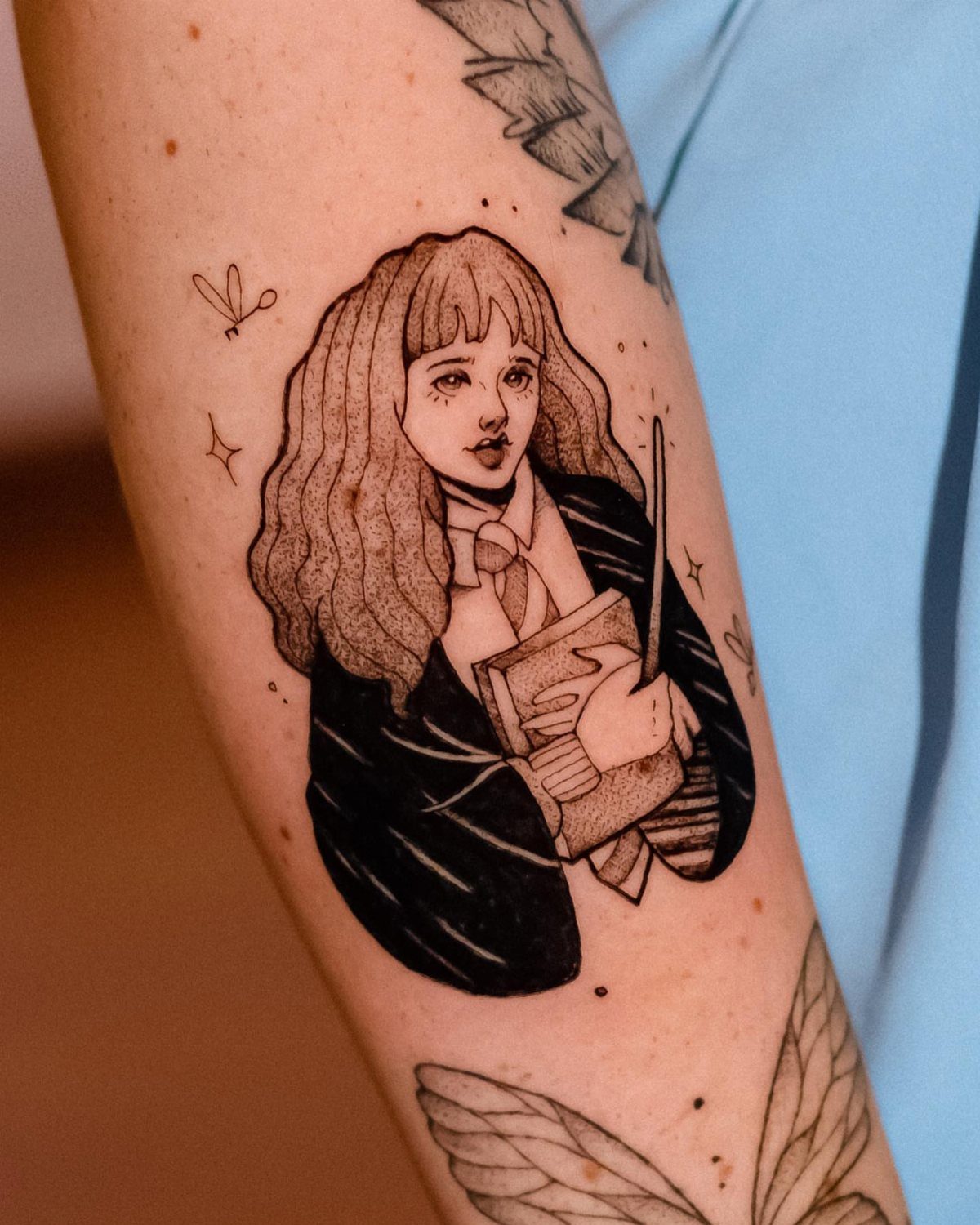
Hermione with her book and wand reads as a character piece, and the arm suits it because the figure is tall and narrow. Her bushy hair is the quick identifier, so protect that shape in the stencil.
The book and wand are small, so keep them big enough to read.
Like any portrait, this one rests on the artist, so check healed faces in portfolios before you book. I’d choose the artist first and the size second.
16. Sirius Black
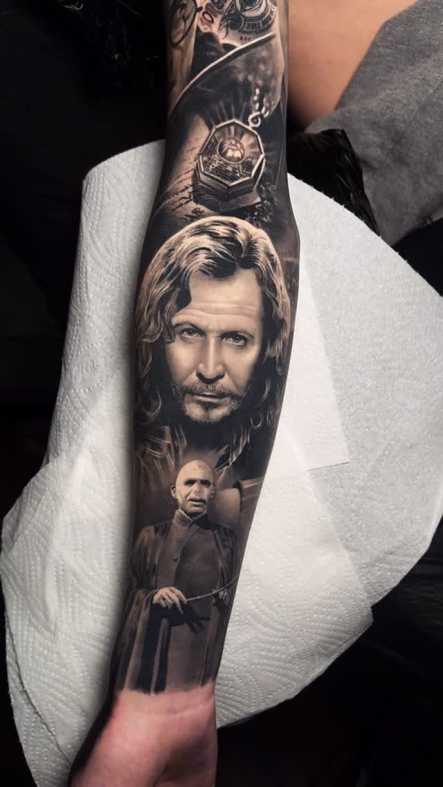
Two portraits and a magical object on one forearm is a realism project, and realism rewards patience. Black and grey suits it, with soft shading doing the work that color would elsewhere.
Faces will be the hard part, so look for healed likenesses in an artist’s portfolio.
Give each portrait enough skin that the eyes stay sharp. I’d avoid squeezing a third element in; two faces and one object already fill the forearm.
17. Mandrake
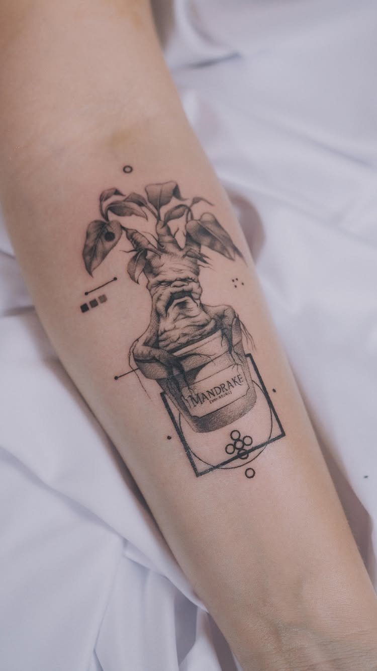
A mandrake in a labeled pot is an odd choice, and that’s why I like it. The root with a human face gives you a small, funny design that still carries real Harry Potter knowledge.
Keep the "MANDRAKE" label large enough that the letters stay open, and leave a little space around the pot so the root’s face stays the focus.
Choosing the Right Tattoo
Start with the spot on your body, then pick the design. A narrow forearm and a wide thigh want different shapes, and a tattoo drawn for one rarely fits the other.
Ask whether the piece will still mean something to you long after the movie marathons fade. A character or object you’ve loved since childhood is a safer bet than whatever is popular this month.
Decide how visible you want it. A tattoo on the ribs or upper thigh stays private, while a forearm shows at work and at family dinners.
Bring a reference photo and your measurements to the consult. An artist can tell you in minutes whether the detail you want fits the space you have.
Tattoo Styles
Minimalist work suits small spots like the wrist, ankle or behind the ear. Thin single lines are inexpensive and quick, but they soften first, so expect a touch-up down the road.
Watercolor tattoos use soft color washes with little or no black outline. They look striking when fresh, yet without a dark anchor they can fade faster, so ask to see healed examples.
Detailed character designs need size and a skilled artist. I’d choose this style only if you’re willing to give it real skin and a longer budget.
If you can’t decide, pick one style and stay with it. Mixing a delicate watercolor wash with heavy black outlines on the same piece often looks unplanned.
Personalization Options
House colors are the simplest personal touch. Use them as the accent in an otherwise black and grey piece, such as a thin band or a single filled shape, and the tattoo stays readable.
A favorite quote works best when you choose it for what it says to you, not how long it is. Shorter lines stay legible and cost less.
Dates and initials add meaning without adding bulk. A birth year or a loved one’s initials tucked beside a symbol can make a common design yours alone.
Explain the reasoning behind each element to whoever is drawing it, since the story behind a symbol shapes how it gets placed. They’ll often suggest a placement or a size that makes the personal detail easier to see.
Frequently Asked Questions
What is the Harry Potter symbol called?
The best-known one is the Deathly Hallows symbol: a triangle, a circle and a line stacked into a single mark.
The triangle stands for the Cloak of Invisibility, the circle for the Resurrection Stone and the line for the Elder Wand.
At small sizes, fine lines hold up fine as long as the triangle, circle and line have a little breathing room between them.
What are some cool quotes from Harry Potter for a tattoo?
"Always" is the classic, and it looks good in red cursive under a line of black print.
"After all this time… Pick the quote for what it means to you; a shorter line costs less and stays readable, and a script with open loops will age better than tight cursive, which tends to blur shut over time.