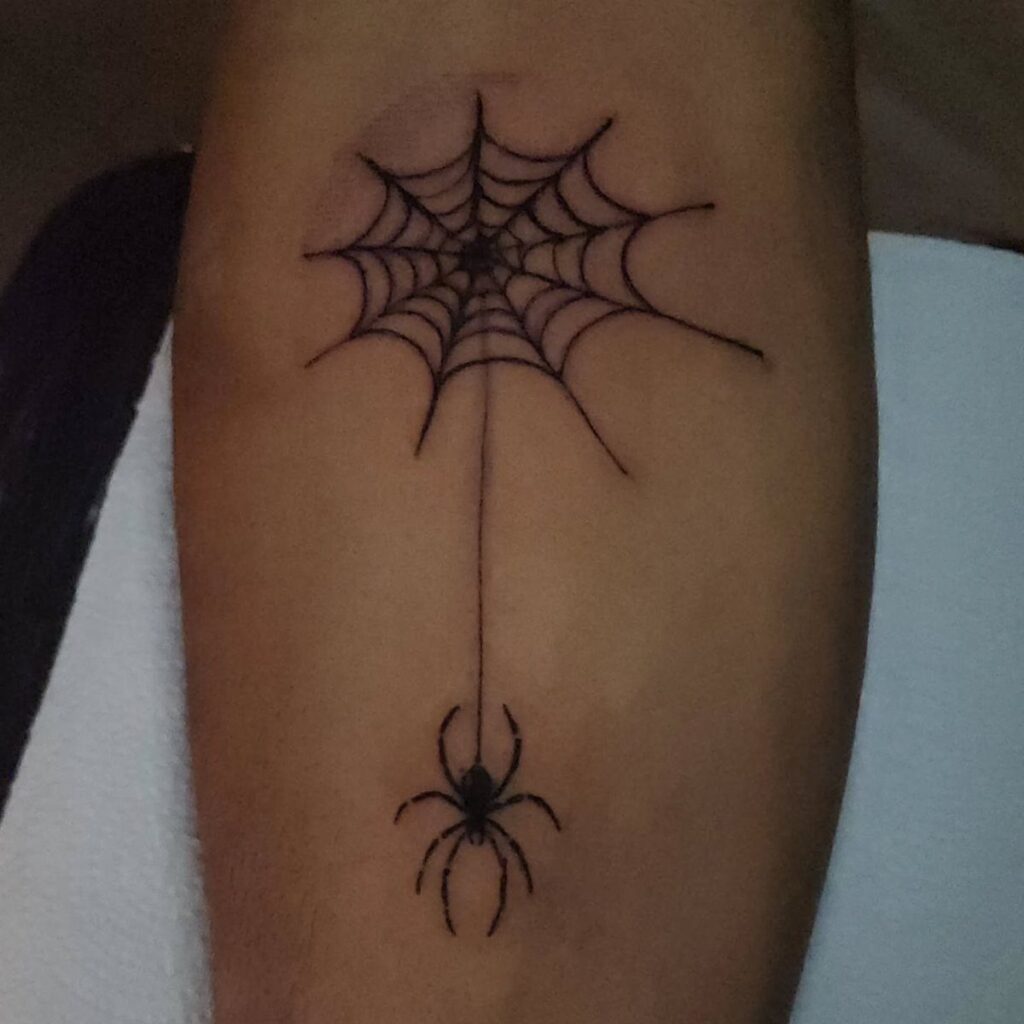
Spider hand tattoos run from a simple black spider to a web, a red accent piece, a realistic spider, a single finger design, a geometric version, or a full spider on a web over skeletal bones, and how much of your hand you’re willing to show decides which one fits.
Work and daily life matter most for the loud placements, because a spider running over the fingers is hard to hide, while a quiet web line along the arm is easy to live with.
Every one of these designs leans on contrast, whether crisp black legs with open gaps, red kept to small touches, or the pale lines of bones against dark ink.
1. Black Ink Spider
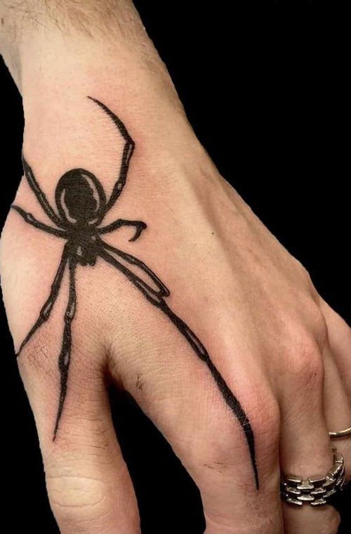
Long legs are what make this spider work on a hand. They stretch across the skin and give a small body a lot of reach, so the design reads from a distance.
Solid black ink is the safest choice here. Keep the legs crisp and the gaps between them open, because that contrast is what holds the shape together as the tattoo ages.
2. Spider Web Tattoo
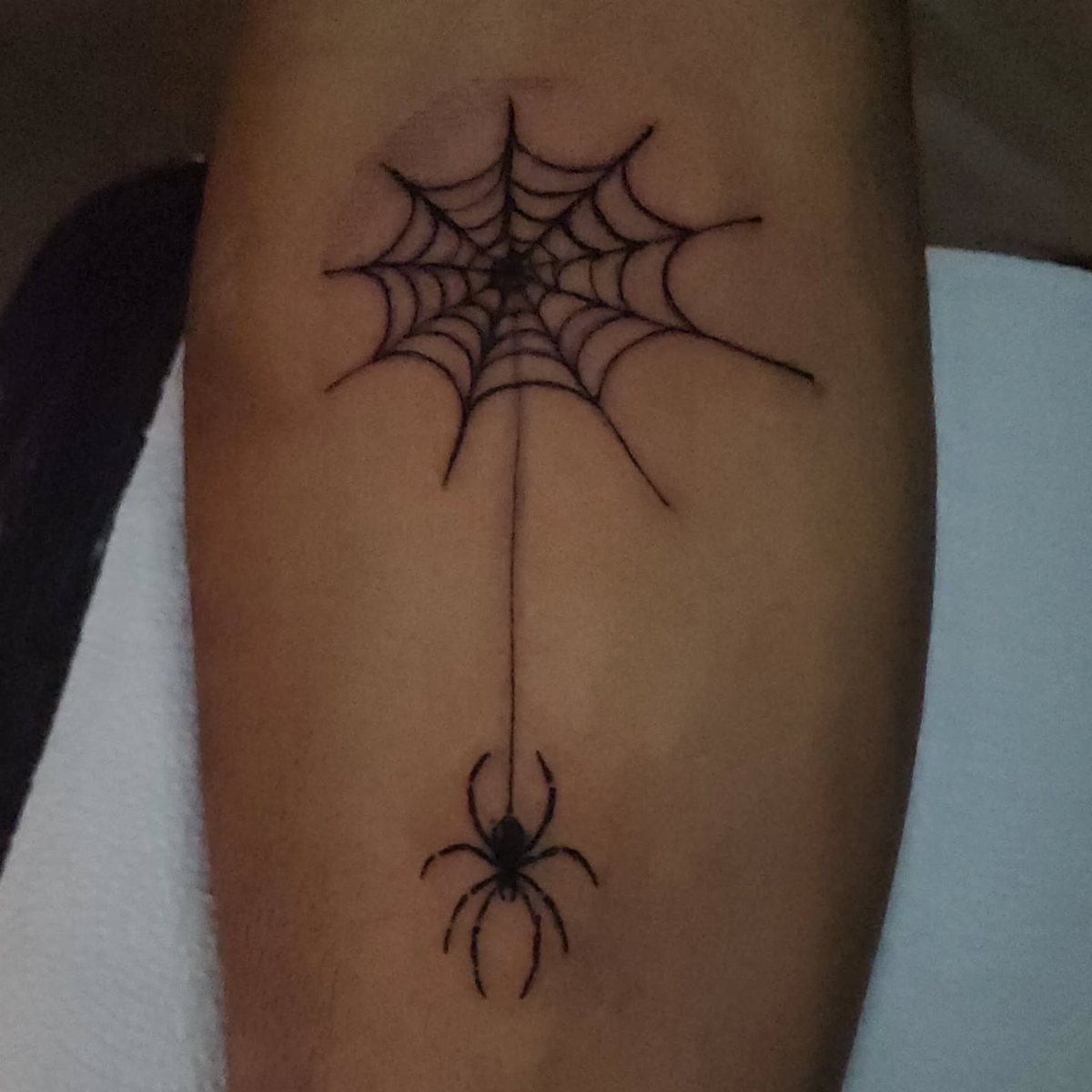
A spider dropping from a single thread is a quieter take on the web idea. The line does half the work, pulling the eye down the arm to the body at the end of it.
Keep the web lines fine and the spider small, since the empty skin around them is part of the design and keeps the piece readable as the lines soften over the years.
Plan for the thread to sit along a natural line of the arm, where it looks drawn rather than placed.
3. Red Ink Spider
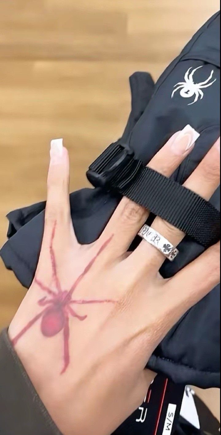
Red changes the mood of a hand tattoo right away. Against skin, a red spider feels warning-like, closer to a signal than a shadow.
Ask your artist how red ink sits on your skin tone before committing, since it reads differently from black. I would pick a bold, simple silhouette so the color carries the design instead of fighting fine detail.
4. Realistic Spider Tattoo
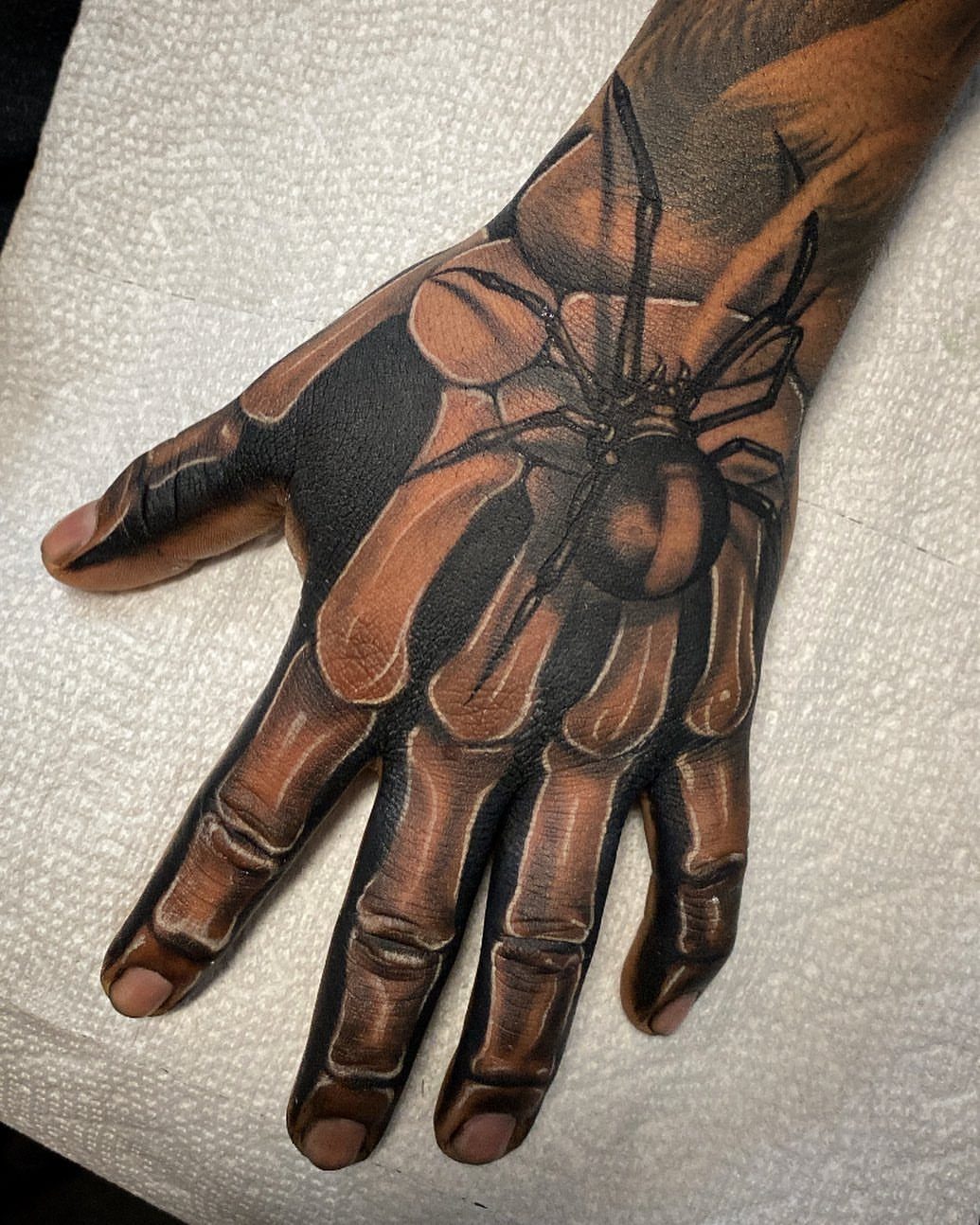
Shading does everything in a realistic spider. The rounded body, the glossy highlights and the tapering legs all depend on smooth gradients that make the ink look raised off the skin.
Choose an artist whose portfolio shows realism healed, not just fresh. Fine gradients on the back of the hand are where I would be most picky, and I would expect to pay for the extra hours.
5. Spider Finger Tattoo
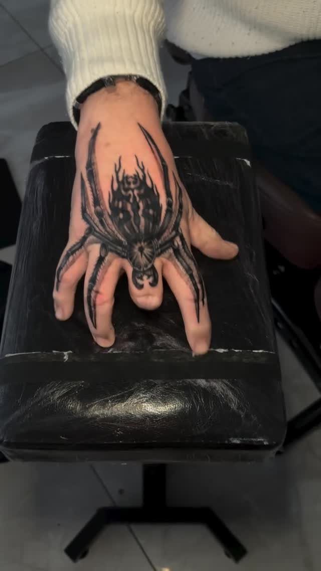
Running the legs over the fingers turns the spider into a piece that wraps the whole hand. It is a big, loud placement, and that is its appeal.
I like it best with thick, confident legs, since thin lines get lost on narrow fingers. Think about work and daily life first, because a tattoo this visible is hard to hide.
6. Geometric Spider Design
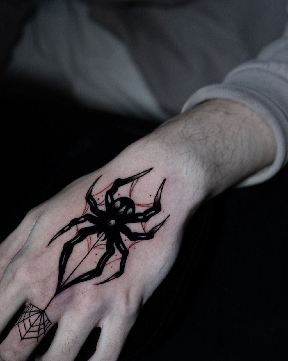
Straight lines and sharp angles break a spider into clean shapes, and a few red accents give the black some heat. A small web on one finger adds a second place for the eye to land.
This style forgives less than organic designs, because uneven lines show. Pick an artist with steady linework, and keep the red to small touches so the geometry stays the focus.
7. Spider on a Web Over Skeletal Bones
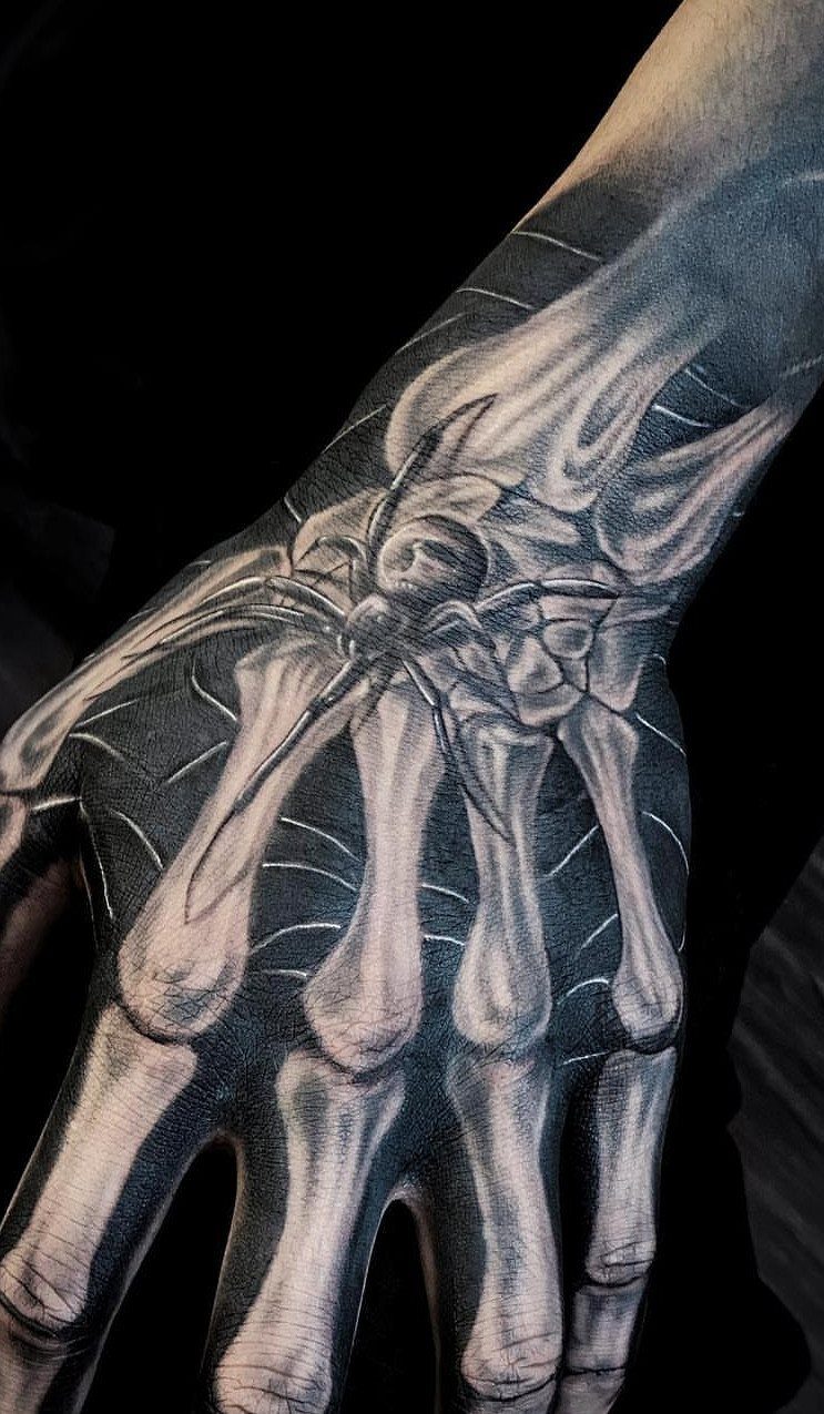
Skeletal bones turn the back of the hand into an anatomy drawing, with the spider and its web sitting on top like something left behind.
Black and grey suits it well, since the bones need soft shading and the web needs crisp lines.
I would keep the web lines clean against the shaded bones so the 2 layers stay separate as the tattoo ages.
A busy hand piece like this needs enough size for the finger bones to read, so think twice before shrinking it.
Ask for a portfolio with healed black and grey work before you book.
Frequently Asked Questions
What does a spider tattoo on the hand mean?
Most people who get a spider tattoo on the hand are saying something about fate, that they accept what the thread has already spun for them. Color and placement change the message.
Red on the back of the hand reads as a warning, while a black spider hanging from one fine line of web feels calmer. On a hand, the meaning is also hard to separate from how visible the piece is.
Which is the best tattoo on hand?
For a spider, I would pick solid black ink with long, crisp legs and open gaps between them. Fine detail and thin lines on a hand soften with time, so simple and bold wins over busy.