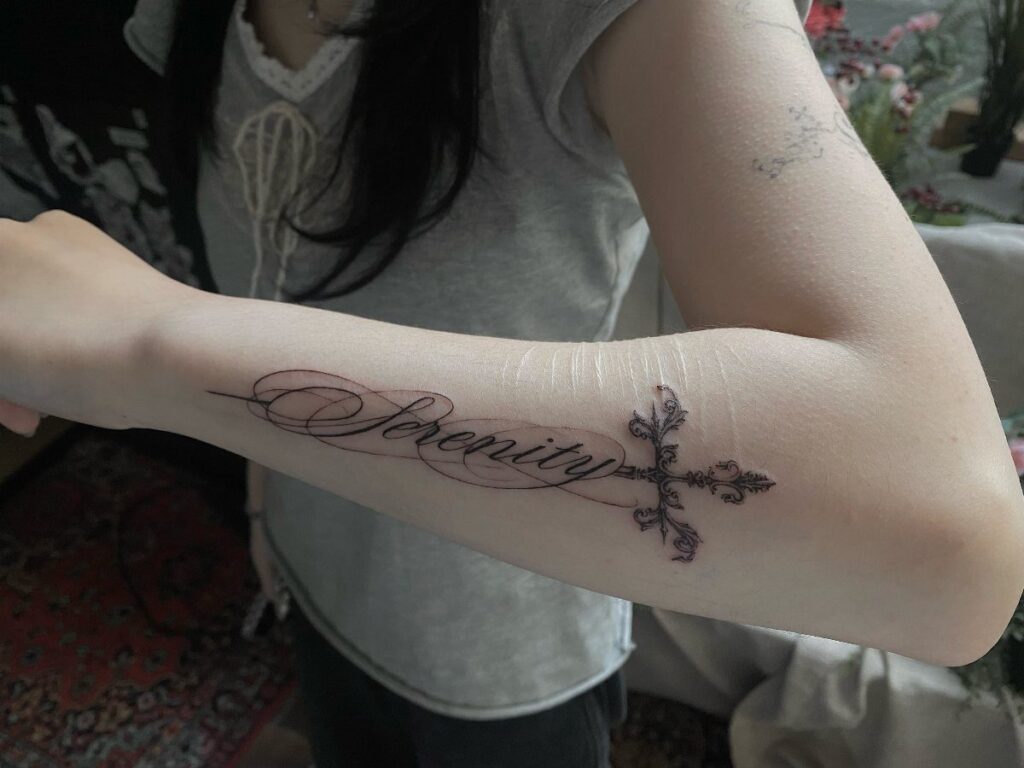
Placement decides more than the design does: the 17 spots here run from the roomy upper arm and thigh, where large work keeps its detail, down to the finger and inner wrist, where fine lines soften within years.
Before you pick a subject, decide whether you want the tattoo seen every day or shown only when you choose; that one call narrows the list fast.
A bony spot like the ribcage stings more than the outer thigh, because pain tracks padding and there is little between skin and bone.
1. Upper Arm
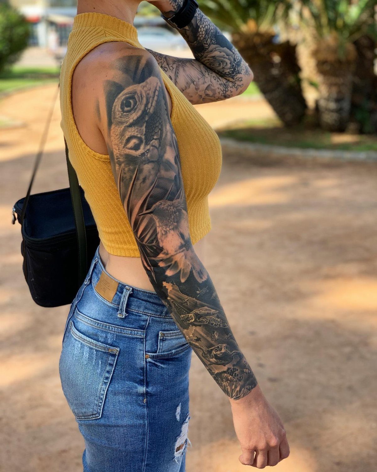
Large designs belong on the upper arm, and an owl or a lizard shows why: the outer arm gives a smooth, roomy surface that lets a big animal keep its detail.
I like it for anyone who wants a statement piece they can hide under a sleeve.
Pick a design that fits the muscle’s curve rather than fighting it, and decide early whether it stays on the upper arm or runs down toward the forearm, since that changes the whole composition.
2. Thigh
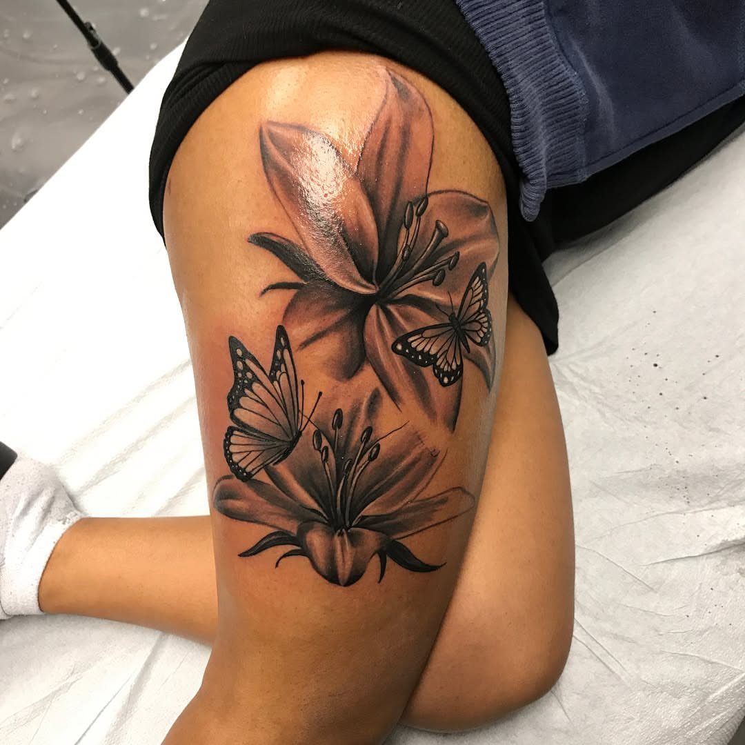
Few spots hold detail the way the thigh does.
I would choose this spot for a large piece you want to cover easily with shorts or a skirt. Black and grey also tends to read cleanly on a broad, flat surface like this.
Plan the size before the subject. A big canvas rewards a design that uses the whole space instead of one small image floating in the middle.
3. Behind the Ear
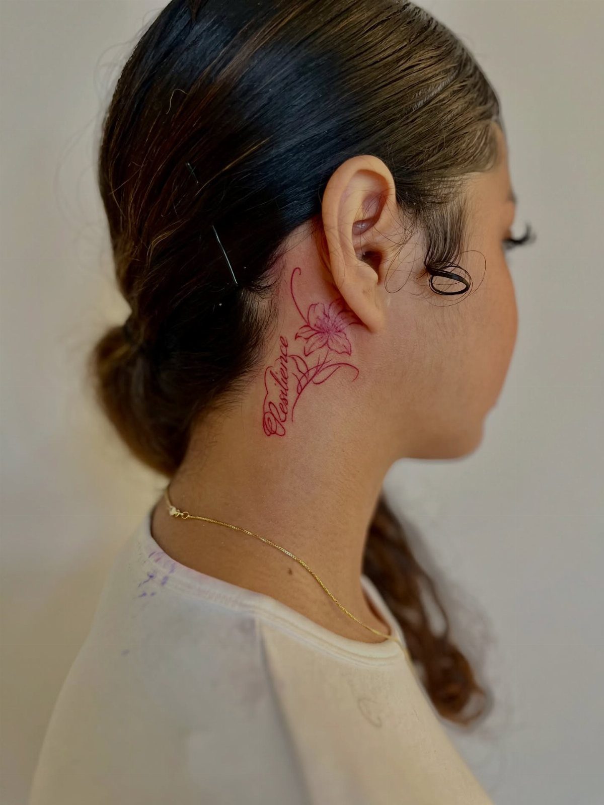
Tucked behind the ear, a tattoo shows when your hair is up and disappears when it’s down. That is the appeal.
A small flower paired with a single word works here because the area is tiny; anything longer gets cramped. Red ink stands out against skin, so keep the lines simple.
My advice: stick to one short word and one small image. If you wear your hair up often, expect this to be seen daily.
4. Finger Tattoos
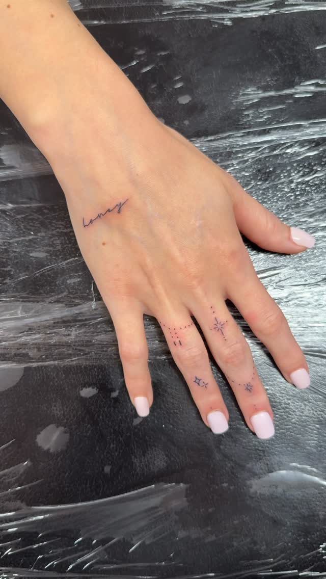
Small, playful marks suit fingers best: stars, dots, a short word along the side of the hand. Keep them tiny and simple.
I like black ink here for its crisp look, but fingers are a tough surface for fine detail, so choose bold, uncomplicated shapes.
Ink on fingers spreads and fades faster than it does on an arm, and fine detail goes first.
Expect to need touch-ups. Ask your artist about that before you commit to a design with many tiny parts.
5. Foot
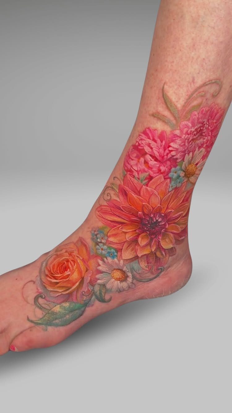
The top of the foot is a small, fairly flat canvas, which suits flowers well, and color holds up there if you keep it out of the sun.
The skin is thin and sits close to bone, so I would expect it to sting more than a fleshy spot. Color on the foot also rewards a confident artist.
Sandals will show it off. Closed shoes will rub it during healing, so plan the timing around your wardrobe.
6. Back
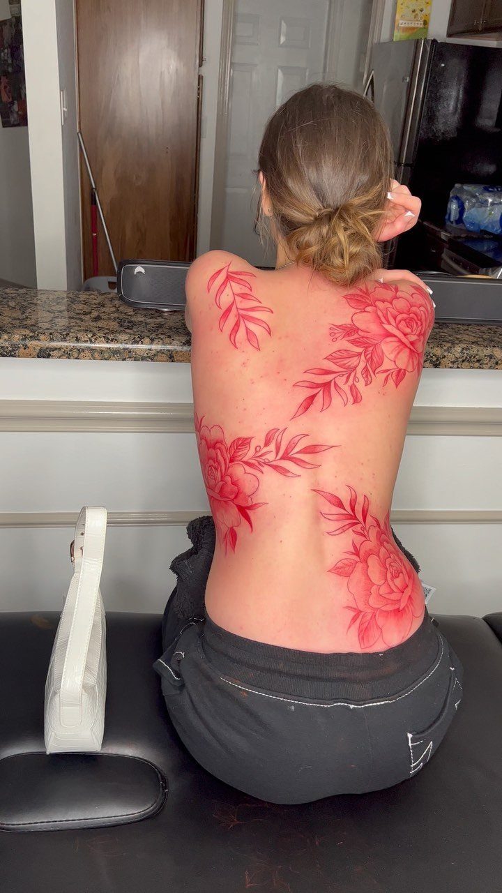
A full back is the largest canvas on the body, and a red floral piece can spread across it in one flowing composition. It also stays out of sight whenever you want it to.
For a big project built over several sittings, the back is my choice, because it gives you the largest uninterrupted surface on the body. Think of the whole space first, then let the flowers follow the shoulders and spine.
Low visibility is the real perk: you get a major piece without it showing at work.
7. Ribcage
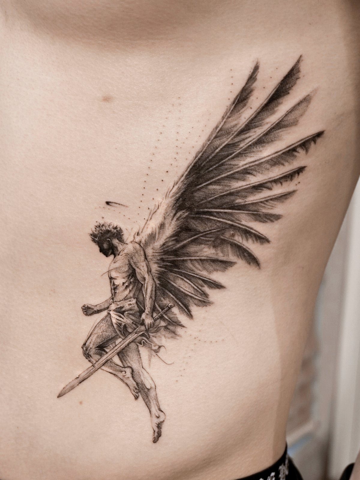
A winged figure with a sword suits the ribcage because the design can run long, following the line of the body from under the arm toward the waist.
I would choose black and grey here, as the visible piece does, since shading reads well on a tall, narrow strip.
Pick vertical or horizontal before anything else; a sword or a set of wings will usually decide that direction for you.
Expect this spot to sting. Over the ribs there is little padding between the skin and the bone.
8. Inner Wrist
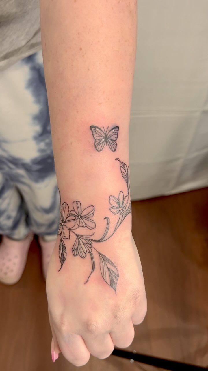
Small symbols and short words suit the inner wrist, and a butterfly with a thin floral vine proves how much a tiny space can hold.
Keep the linework open and the shapes simple, because fine detail softens over the years on skin that gets this much sun and washing. Black ink is my pick for staying crisp.
Wrists are seen constantly, so choose something you will not tire of. A single vine can wrap the edge of the wrist instead of sitting in one block.
9. Glutes
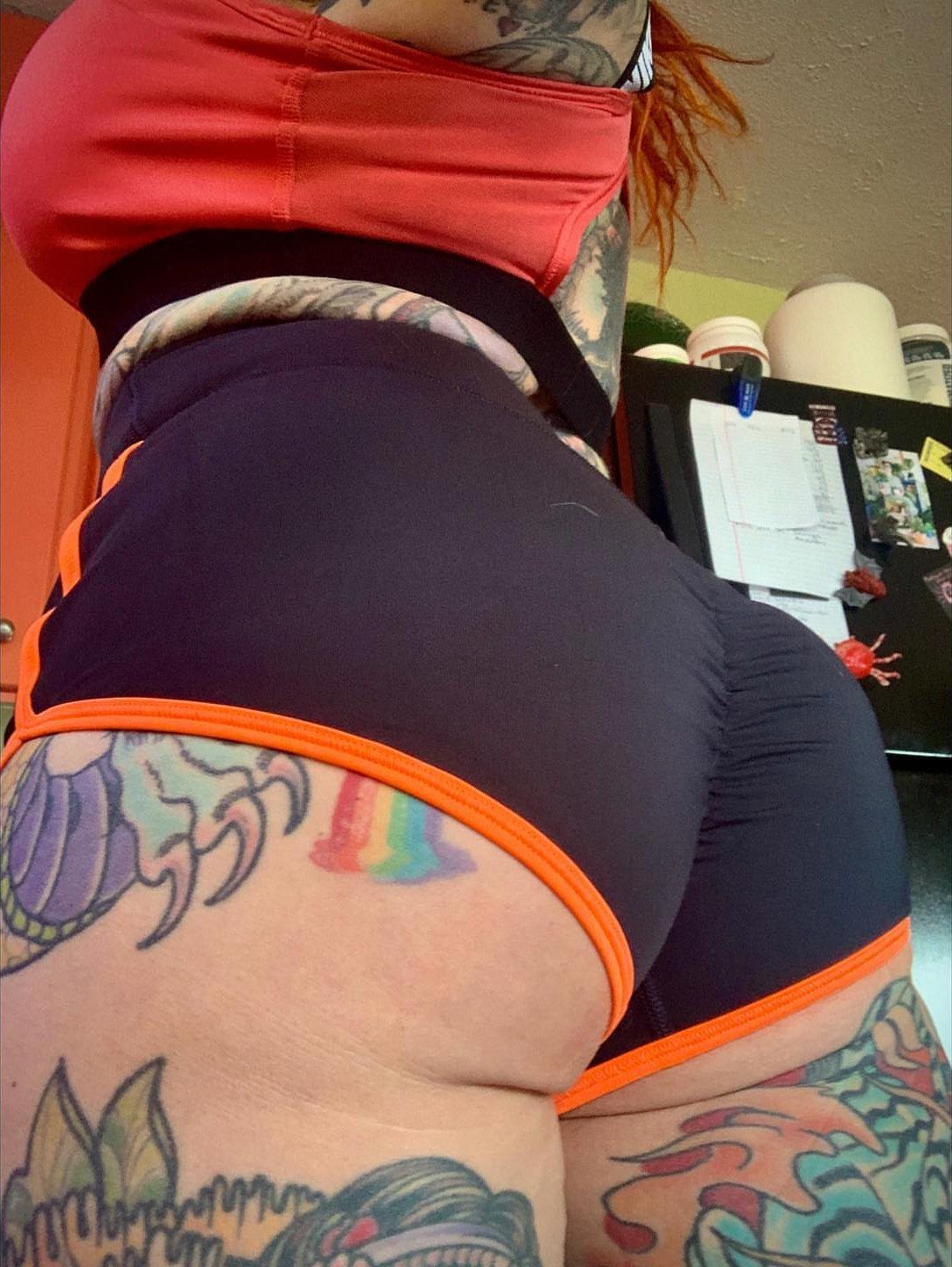
Glutes give you a wide, padded surface, which makes them one of the few places where a large, colorful design can spread without crowding.
I would plan the piece so it continues naturally onto the hip or upper thigh, as the visible one does, instead of stopping in a hard edge. Think about how the design moves when you sit and stand.
Shorts and swimwear will show it; most other clothes will keep it private. That makes it a good spot for a bold piece you want to control who sees.
10. Nape of the Neck
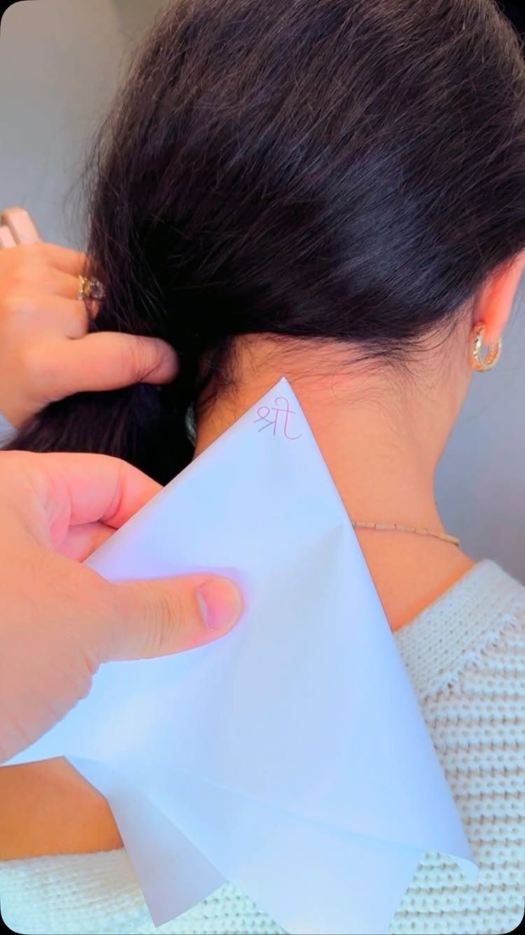
Few spots feel as private as the nape of the neck: you rarely see it yourself, and hair covers it whenever you choose.
A short word in small red script, like the visible one, fits the narrow width well. Keep the lettering simple and give each letter room, since tight script blurs first.
Pick a word you are happy to have seen.
11. Forearm
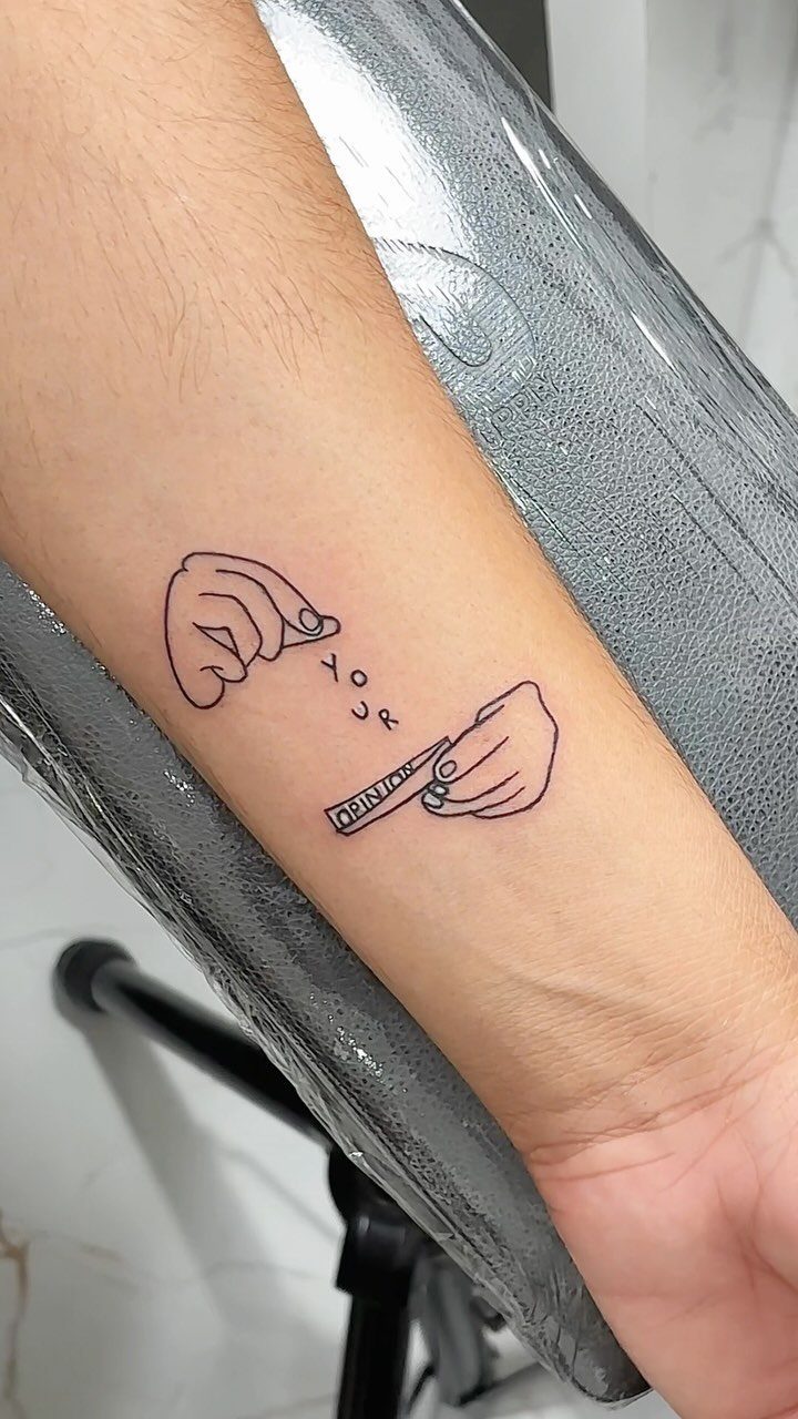
For a medium or large design, the forearm is a flat, easy surface to work on, and line art like 2 hands holding a slip of paper sits cleanly on the inner side.
I like it because you can see the tattoo yourself, which suits a piece with a message. Make sure any lettering is big enough to read at arm’s length.
Sleeves hide it, but short sleeves will not. That matters if your workplace is picky.
12. Ankle
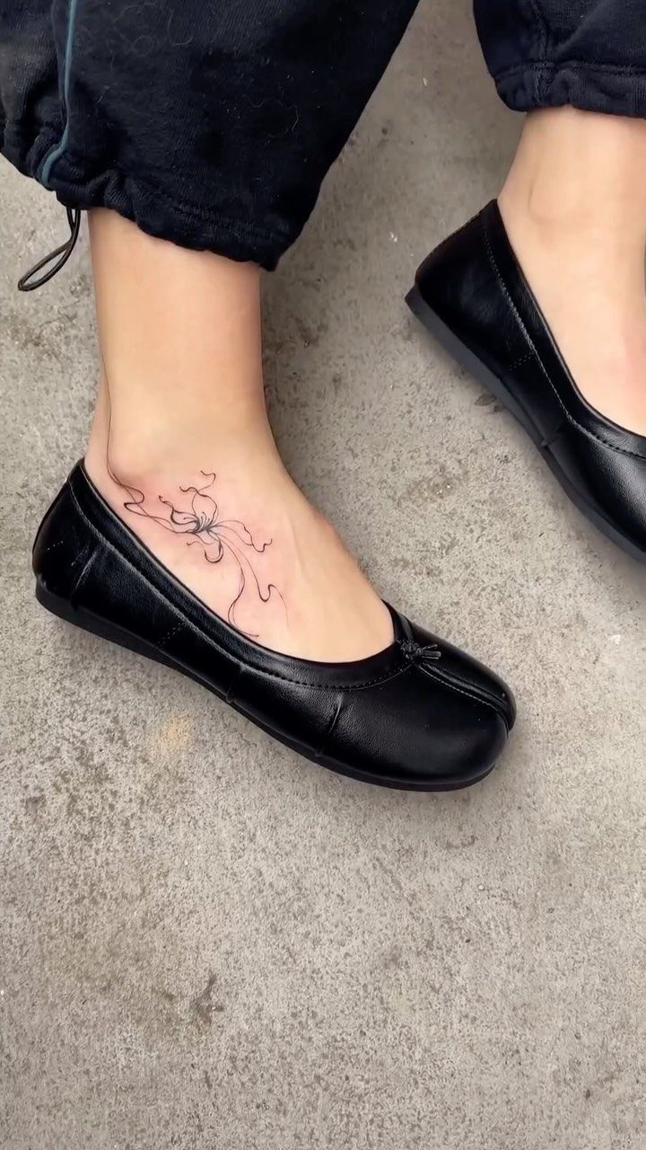
A small, fine-line spider sits well on the ankle, a spot that suits subtle tattoos you can show or hide with a pant leg.
A small design with clean lines is my pick for this spot.
Flats show it off; boots will not.
13. Collarbone
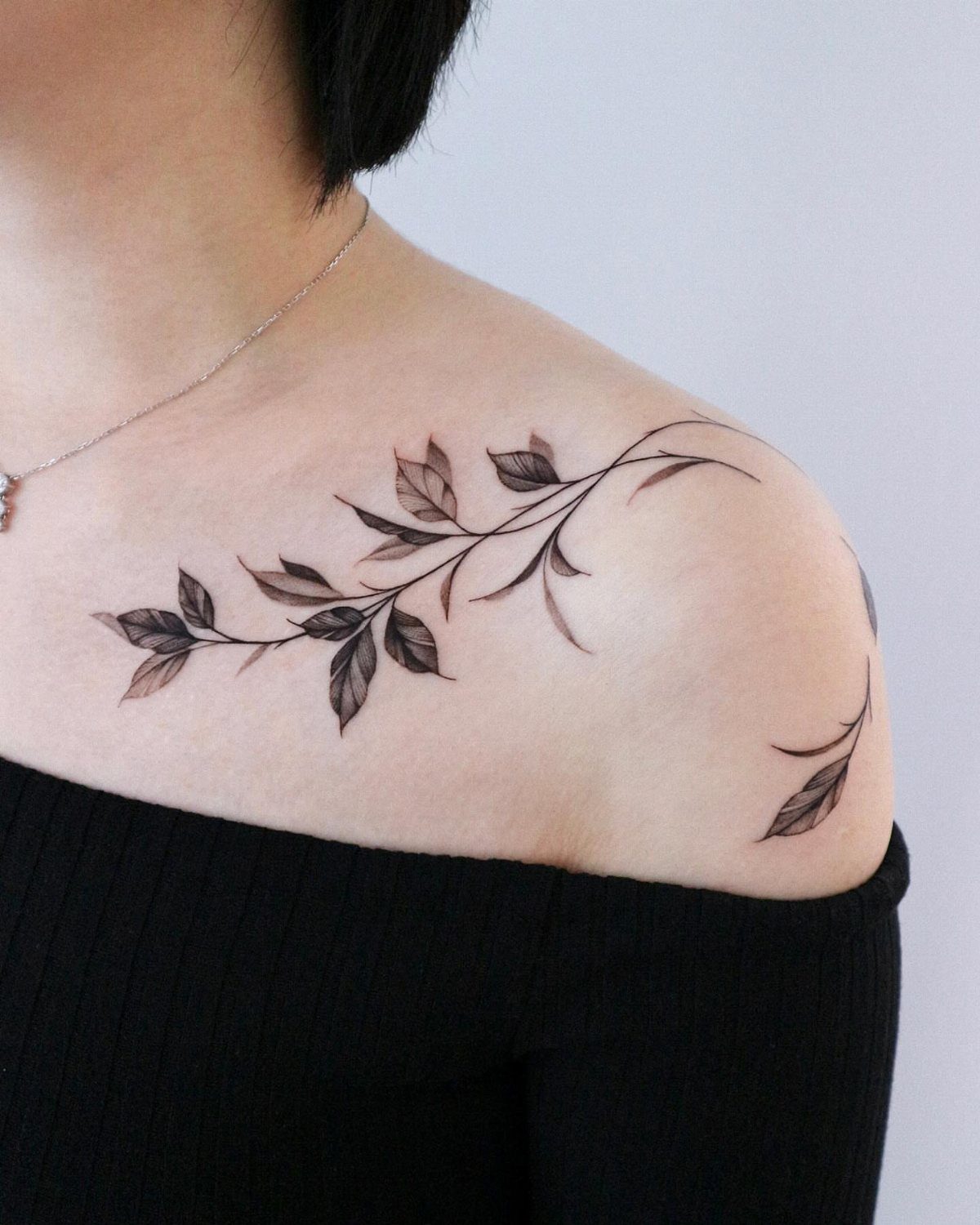
A leafy branch follows the line of the collarbone well, because the bone already draws a clean horizontal for the stem to run along.
I like fine black linework here. Let the branch reach toward the shoulder so it reads as one flowing piece rather than a patch.
Necklines decide how much shows, and an off-the-shoulder top shows all of it. Keep the leaves light and spaced, since crowded detail looks heavy on a delicate area.
14. Sternum
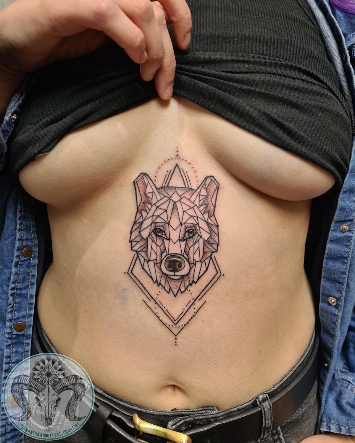
Between the breasts, a geometric wolf head sits on the sternum’s flat center line, and symmetry is what makes a design like this work.
Stay with sharp, even linework so both sides of the face match. Higher necklines hide it completely, which suits a personal piece you choose to share.
I would expect the bone beneath the skin to make this spot sting. Pick a design you want to live with privately.
15. Hip
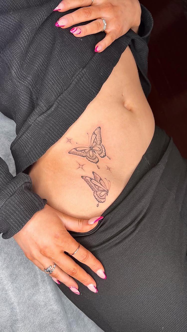
The hip takes a tiny butterfly with a few stars just as well as a bigger piece, and it leaves room to add more later.
Spacing is my main advice. Leave room between the pieces so you can add more, or let a larger design wrap toward the lower abdomen.
Waistbands and swimwear will show it; most tops will not. Start small if you are unsure, since adding to the hip is easy.
16. Lower Back
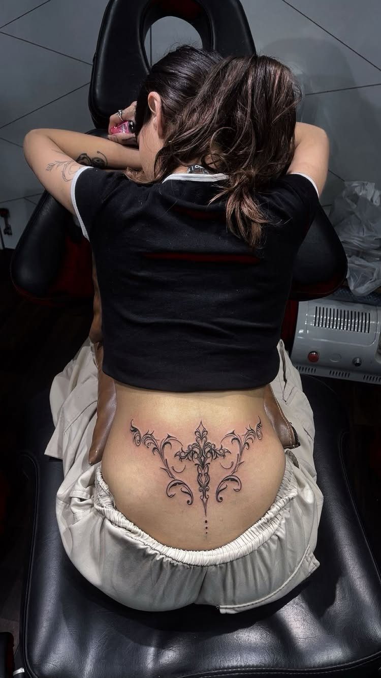
Symmetry is what the lower back does best, and an ornamental design centered on the spine shows it, with both halves mirroring outward.
A design with a clear center point and even weight on each side works best here, since any slant stands out on such a balanced area.
It is one of the most common spots for tattoos, so a design that feels personal matters more here. Ask your artist to size it to your frame.
17. Under Boob
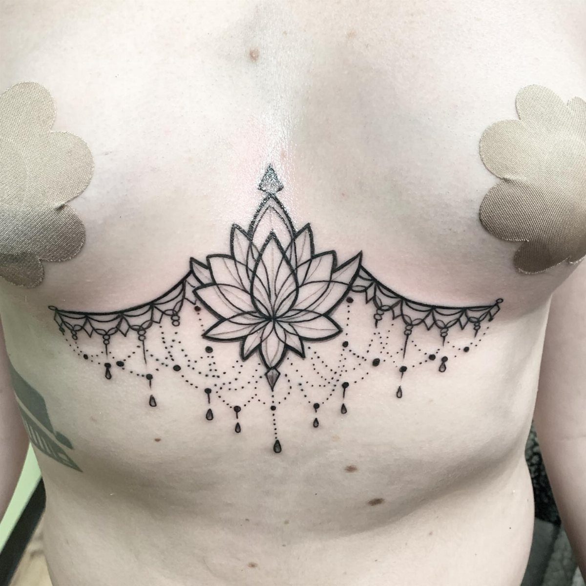
Under the breast, a lotus with beaded details follows the natural curve of the ribs, which makes the fall of the beads look intentional.
I like black ink for this, because the fine strands stay readable. A hanging, chandelier-style element works since it uses the downward space.
Tattooing here can sting, so I would plan a short session. Bras and swimwear cover it, so the design stays yours to show.
Pain Tolerance Considerations
Pain follows padding.
For the easiest sessions, I would look at the upper outer thigh, forearm, outer shoulder, outer bicep, and the fleshy areas of the upper and lower back. Calves belong on that list too, for the same reason as the thighs.
The harder spots include the armpit, elbow, kneecap, shin, neck, head, face, hands and toes.
Everyone’s tolerance differs, so tell your artist where you’re nervous before you book. A spot that one person calls bearable can feel unbearable to another.
Visibility and Professional Life
Decide who gets to see this tattoo before you decide what it is. Do you want it noticed daily, or kept as something you reveal when you choose?
Think about your career as well. If your job may ask you to cover up, placement affects your future options, so picture the workplace you want in a few years, not just the one you have now.
Personal imagery adds another test. If the piece is private, ask whether you want family and friends seeing it all the time.
Skin changes with age, and that shifts how a design looks in any spot. Ask yourself how it will age in the place you’ve picked.
Future Body Changes
Bodies change, and a tattoo changes with them. Weight gain, weight loss, aging and pregnancy can all alter how a design looks.
Choose an area that is unlikely to shift much, or one where you would accept the change if it happens. That is a more honest test than hoping your body stays as it is today.
Placement also affects your future, so think about where you expect your life to go. A spot you plan around now should still suit you later.
Frequently Asked Questions
Where do people find tattoo ideas?
Many people look at the style first and let it point to a spot.
Portrait and realism designs need flat, roomy areas like the back, upper arm, forearm and outer thigh, while geometric, floral and pattern designs adapt to almost anywhere.
Pick a placement first, then search styles for that exact spot: word tattoos tend to sit on the upper back, along the spine, down the forearm or on the inner bicep, and that pairing cuts the pile of options down quickly.
How visible do you want your tattoo?
Decide that before you pick the design.
Decide whether you want people to notice it every day or to see it only when you choose, and think about the job you may hold in 5 years, since that may differ from the one you have now.
What are the most painful tattoo placements?
The ribs, feet and hands rank among the worst spots, because pain tracks how little padding sits over the bone.
Thin skin over bone leaves little cushion, which is why a ribcage or sternum piece stings more than one on a fleshy area.
What should I consider before getting a tattoo?
Think about pain, visibility and how your body may change.
Body changes like weight swings, aging and pregnancy can stretch or shift a design, so I suggest an area that stays fairly stable or one where you would accept some movement.
Your career matters too, since a spot you may need to cover can limit your options later.